
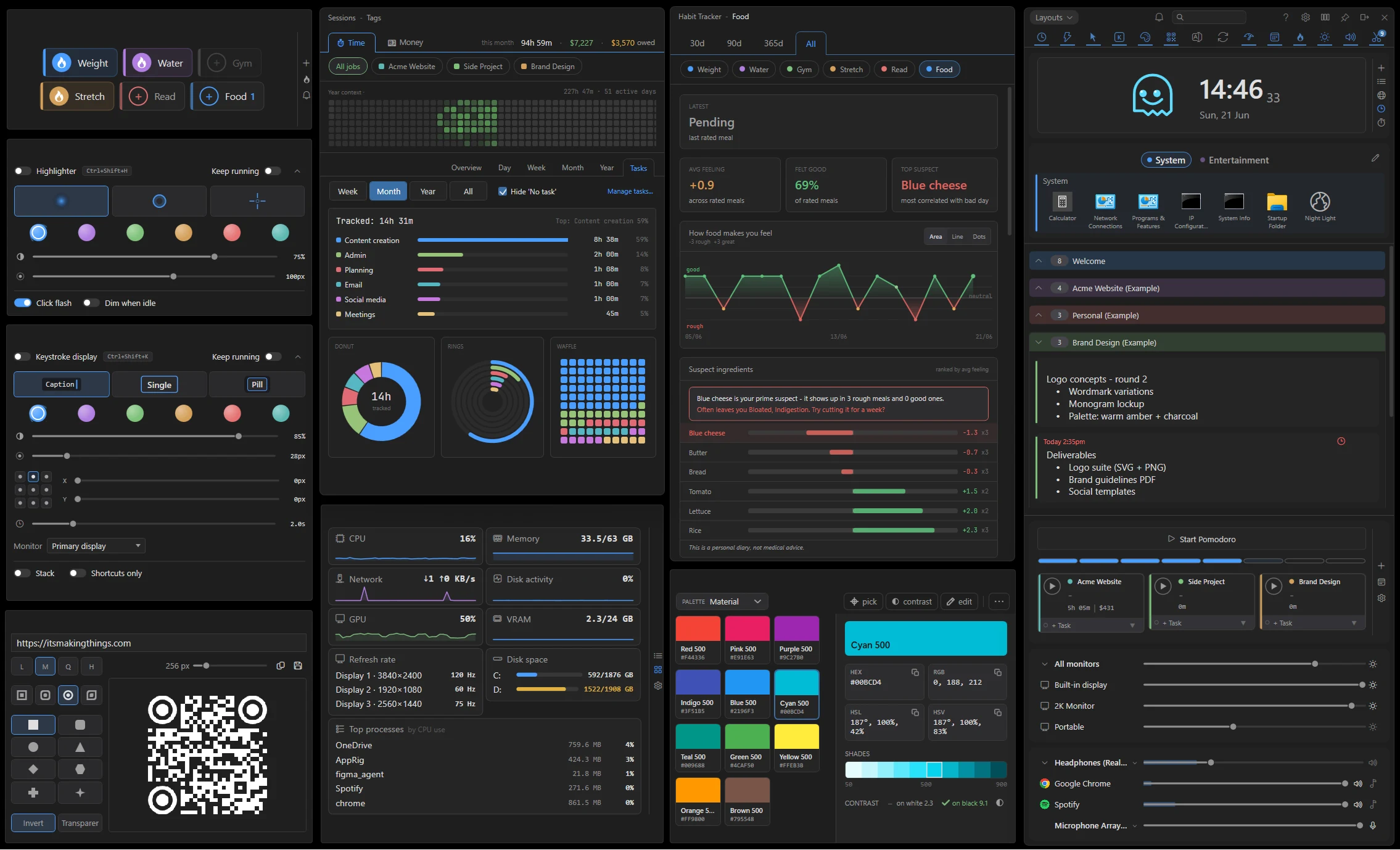

Getting started
After install, AppRig places an icon in your taskbar tray (next to the clock). The main window opens centred on your primary monitor the first time you launch it.
The tray icon is your home base
- Click the tray icon to show or hide the main window.
- Right-click the tray icon for a menu with Quick add, an About entry (opens Settings on the About page) just above Settings, and Quit, plus your 5 most recently edited notes and 5 most recently edited lists, for quick access without opening the main window.
- Closing the main window with × hides it back to the tray. It doesn’t quit. Use the tray menu’s Quit to fully exit.
- The tray icon itself shows a few active states at a glance: a slash through it means Silent mode is on, a small amber sun badge means Keep awake is on (see Keep Awake), and a small blue Bluetooth badge means Keep Bluetooth audio awake is on (see Sub-tool: Mixer).
What’s seeded on first launch
A fresh install opens a full-page welcome card and starts with a lean default layout: Clipboard, Volume, Brightness and the Clock open, with Quick Access and the Time Tracker available but closed. There’s also a single Welcome reminder on the notification bell; clicking the bell opens the Welcome card with the basics. The starter notes list is called Welcome. The clock buddy (Orbit by default) greets you with a short, one-time welcome sequence the first time it appears.
Beyond that, the install is pre-filled with example data so you can see what AppRig can do rather than starting from an empty window. There are four example workspaces (Example 1 to 4), each showing a different layout and a different set of active tools, so you can flip between them and see how differently the same app can be arranged. Alongside them are five how-to guide lists covering the core workflows: tracking your time, capturing notes and launching apps, controlling your screen and sound, batching files, and presenting. The Time Tracker starts with three example jobs (Example Job 1, 2 and 3) demonstrating hourly, time-only and flat-fee billing, Quick Access starts with two starter groups (System and Entertainment), and the Time Tracker and Habit Tracker come pre-filled with a few weeks of example history so their charts aren’t empty. Have a look around, then delete the examples and start your own records. AppRig will not re-seed once you’ve started.
The main window
The main window has three parts:
- Title bar with the help, settings, board, keep-on-top (pin), dock, and close buttons, plus the notification bell and workspace pill.
- Activity bar with one tab per sub-tool plus a Notes tab. The tabs toggle each panel in or out of view.
- Notes panel showing your lists and cards (when the Notes tab is active).
Title-bar buttons
The title-bar buttons (help, settings, board, keep-on-top, dock) stay visible all the time rather than fading out when the mouse moves away. Each glyph is grey normally and turns white while its mode is on (board layout on, kept on top, docked) and the help button turns blue while the hint bar is showing.
The hint bar
Click the help (?) button in the title bar to show a thin strip along the top of the window that explains whatever control you point at, including the relevant hotkeys. When you switch it on it shows “Hover over a tool to see what it does.” until you point at your first control. Click the button again to hide the strip; your choice is remembered. On by default.
Pinning the window
The pin button in the top-right toggles always on top. Pinned, AppRig stays above other windows so you can keep notes visible while working in another app.
Docking to the screen edge
The dock button snaps the window to whichever screen edge (left or right) is closer to the window’s current position. Drag the window to the side you want and click Dock. The icon and tooltip update as you drag to show which edge it would snap to. Click the dock button again to undock and float freely.
Resizing
The window auto-fits to whatever’s open: hide the notes panel and a sub-tool panel and AppRig shrinks to fit. Drag the bottom edge while the notes panel is visible to set your preferred notes height. That preference sticks across toggles. The top edge of the toolbar is a 10 px resize hot-zone, so you can grab the window from the very top to resize it vertically.
Hiding it completely
Toggle every tab off and the window collapses to just the title bar plus the activity bar. Click any tab to bring its panel back.
Close button
The × button hides the window to the tray rather than quitting. Same behaviour as Discord, Slack, and similar tray-resident apps. Use Quit in the tray menu to fully exit AppRig.
There’s no Minimize button on Home. It created a third state (visible / hidden / minimized) the global show/hide toggle couldn’t always recover from. Win+Down still works as a Windows-level minimize, and the show/hide hotkey restores from it.
Tray-only mode
In Settings → Window, turn on Tray-only mode to hide AppRig from the taskbar entirely. The main window, pop-out lists and tools, and the Time Tracker’s All sessions window all stay off the taskbar. In this mode AppRig is only reachable via the tray icon, the global hotkey (Ctrl+Alt+A), or Quick Add. Toggling it updates every open window immediately.
Hover-corner peek-through
Move the cursor into the corner of the main window and AppRig hides itself so you can click whatever app is behind it. A small dot stays at that corner as a visual anchor for where AppRig was, and stays click-through so it never traps a click meant for the app behind. On by default.
The first few times you peek, a small hint appears beside the corner dot telling you how to bring the window back (it names your show/hide hotkey, Ctrl+Alt+A by default). It has a single Change how peek works in Settings link that opens Settings → Window (where you can turn peek off or switch it to auto-restore), plus a “Don’t show this again” checkbox. Pressing the hotkey both restores the window and clears the corner dot.
Peek-through is a docked-window feature. The dot is small and follows the docked edge, sitting right in the corner of the toolbar: the top-right corner of the Close button when docked right (the toolbar buttons run flush to the screen edge), or the top-left corner when docked left, so you don’t have to cross the whole window to reach it. The hover area that triggers peek is a tight square right at that corner rather than a wide strip, so a quick flick of the mouse into the corner still brings AppRig back. When the window is floating (undocked) there’s no screen edge to tuck into, so peek-through is off and the dot is hidden. Turning peek-through off in Settings hides the dot entirely too.
Peek hides only your unpinned floating windows: pinned sticky notes, pop-outs, and lists stay on screen, while unpinned ones disappear along with the main window. The floating Time Tracker sessions window is hidden by peek too. The setting that controls this is “Peek hides unpinned windows too”.
Two further options sit under the toggle in Settings → Window:
- Auto-restore when cursor moves away (on by default). On: the window comes back as soon as the cursor moves further than the configured distance from the dot. Off: the dot acts as a switch. Hover it again to bring AppRig back, or use the show/hide hotkey or tray icon.
- Auto-restore distance slider, from 50 to 2000 px (default 500). Higher values suit larger or higher-DPI monitors.
Multi-monitor: window follows your cursor
When you open the home window from the tray (or via the global hotkey) and it’s undocked, it appears on whichever monitor your cursor is currently on. Docked windows stay anchored to their docked edge.
Notes & cards
Three view states
Each card cycles through three view states when you click it:
- Single-line preview (most compact)
- Three-line preview
- Fully expanded
Editing
Hover a card and click the pencil icon, or press Ctrl+Click to enter edit mode. Click outside or press Esc to save. In Settings → Cards & lists you can swap clicks so plain click goes straight to edit instead.
Formatting
Standard rich-text shortcuts work inside cards:
- Ctrl+B: Bold
- Ctrl+I: Italic
- Ctrl+U: Underline
Type a hyphen (or *) and a space at the start of a line to begin a bullet list, or a number and a dot (1.) to begin a numbered list. Press Enter on an empty item to end the list.
Build multi-level lists with Tab and Shift+Tab: Tab inside a list item indents it into a sub-bullet, Shift+Tab outdents it, and Shift+Tab on a top-level item turns the line back into plain text. Sub-levels are numbered automatically: bulleted lists step through a filled dot, a hollow dot, then a square as you indent; numbered lists step through 1. then a. then i. Typing - or * inside a numbered list turns that one line into a bullet where the cursor is, rather than adding a stray bullet above the whole list.
Pasting a bullet or numbered list copied from Word, VS Code, or another note keeps its structure. The markers turn into real list items instead of literal “1.” text you have to clean up. Copying a list out of a note keeps its markers too: it pastes as - item / 1. item into plain-text targets like a code editor or chat box, and as formatted bullets into Word or Outlook.
Add a link with [label](https://example.com). Typing or pasting a web address into a note also turns it into a blue, clickable link as soon as you finish it: type a space or press Enter after the address. This works the same in the main list, in floating sticky notes, and in popped-out cards. In edit mode, Ctrl+Click the blue text to open the link in your browser.
Copying formatted text from one note and pasting it into another keeps the formatting (bold, italic, underline, strikethrough, links and lists). Pasting text from other apps still comes in clean, without importing foreign fonts or colours, and Ctrl+Shift+V pastes the clipboard as literal plain text with no bullet auto-formatting.
Pasting an image (Ctrl+V) inserts it inline. Image data is stored with the card and survives save/reload.
Resizing pasted images
Pasted images are automatically sized to fit the card width on insertion, so you never get a big screenshot blowing past the card’s edge. Click any image in edit mode to enter resize mode. A thin accent border appears, with a small drag-handle on the right edge and a corner-handle at the bottom-right.
Drag either handle to resize. The width is aspect-locked (height tracks the original picture’s ratio), clamped to a minimum of 48 px, and capped at the card’s content width. The chosen size persists with the card and is applied the next time the card is rendered.
Click anywhere outside the image, or press Esc, to leave resize mode.
Card header icons
Hovering a card reveals a row of action icons. From left to right: delete, edit (pencil), pop out as a sticky, keep open (eye), favourite (star), and due date (clock) on the far right. The keep-open and due-date icons stay visible while they’re active; the rest appear only on hover.
- Star adds the card to the synthetic Favourites group at the top of the main window.
- Eye keeps the card fully expanded all the time, regardless of the three-state cycle.
The clock (due date) is covered under Reminders & due dates below.
There’s no longer a “lock to top” button on cards. Drag a card to the top of its list to order it manually instead. The pin (keep-on-top) button on a floating or popped-out card or list is a separate control and only governs whether that floating window stays above other windows; it never changes the docked order.
Reordering & moving
Drag a card by its edge to reorder it within a list, or to move it into another list entirely, including into and out of popped-out single-list windows. A translucent ghost of the card follows the cursor and the surrounding cards reflow to open a slot where it will land, so you see the result directly; release to drop it into the slot. Dragging a card to the top or bottom edge of a long list auto-scrolls it, so you can drop the card somewhere off-screen without letting go. In board view, holding a card against the left or right edge scrolls the columns the same way, so you can drag a card into a column that isn’t currently in view. Ctrl+Z undoes the most recent card move.
Empty lists are drop targets too: drag a card over an empty list and it highlights to show where the card will land; release to drop it in. Dropping a card onto a collapsed list expands that list and adds the card at the bottom, so it never disappears from view.
List-level cycle
Hover a list title to reveal a chevron on the right. Click it to cycle every card in that list through the same three view states. Useful when you want a uniform view of a whole list.
Zoom anchoring
Hold Ctrl and scroll over your notes to zoom the note text in and out; the card under your cursor stays anchored in place as the size changes, and Ctrl+0 resets it. This zooms the note text only. The rest of the interface is sized by Interface size (Settings → Window), and scrolling with Ctrl over a sub-tool resizes that tool instead. Scroll position also stays where you left it after editing a card. AppRig no longer nudges the viewport after you save.
Reminders & due dates
Any card can carry a due date and an optional time. When the time comes round AppRig fires a Windows tray toast; clicking the toast pops the card out as a floating sticky so it’s already in front of you.
Setting a due date
Hover a card and click the clock icon in the icon strip (also available in the toolbar of any popped-out sticky). A small calendar popup opens with:
- Three quick-pick chips at the top: Today, Tomorrow, and the next instance of your configured quick-pick weekday (defaults to Friday).
- An inline month calendar. Click any day to pick it.
- A Reminder time dropdown in 15-minute increments, pre-filled with the current time of day. Adjust it as needed, or clear it to set a date-only due (no toast will fire).
- A Remind dropdown that picks how far ahead of the due time the reminder fires: at the due time, or 10 minutes / 1 hour / 1 day / 1 week (and more) before it. The notification bell, the card’s “due soon” highlight, and the clock buddy all surface the reminder at that lead time. Set the default for new reminders in Settings → Notes & lists → Default reminder time.
- A Repeat dropdown that reads back the date you picked: One-time event, Daily, Weekdays (Mon to Fri), Weekly (every Monday), Bi-weekly (every other Monday), Monthly (every third Monday), Monthly (on day 31) or Yearly (on 30 June). A repeating reminder re-arms itself for the next occurrence after it fires, and recurring reminders show a small repeat mark (↻) next to their due date on the card. “Monthly on day 31” and “Yearly on 29 Feb” fire on the last day of short months, then return to the 31st / 29th whenever a month or year can hold it again.
- Set to save, Clear to remove the due date, and (when the existing date is already overdue) a Snooze button that bumps it forward by your configured snooze interval.
You can set a due date / reminder while creating a note: a new note’s editor has a reminder clock alongside its bin (delete) button (grouped at the far right). The note starts saving as you type, so it survives AppRig closing or crashing before you click away; the bin discards it cleanly if you change your mind, and Esc discards it too. Quick Add carries the same reminder clock in its toolbar, so you can give a quick-captured note a due date as you jot it down. The clock turns the accent colour once a date is set.
How the card shows the due date
Once set, the due date sits in the card header, always visible, even when the card is in its compact single-line view. The header colour warms as the deadline approaches: the accent tint kicks in within 24 hours, brightens once the due date is today, and switches to red once the time has passed. The shift is driven by a per-minute tick so the colour updates live while AppRig is open. The “last edited” timestamp moves into a tooltip on those cards (so the header doesn’t get crowded).
A popped-out (floating) card reflects the same status. Its clock icon stays lit whenever a due date is set and turns red once the card is overdue, and the card’s top-left corner shows the due date (or the card’s list name when you hover it).
The notification bell
A notification bell sits to the left of the search box. It’s always there (grey) so you know where to look; when a card is overdue or due within the next 24 hours it turns white and shows a small count circle in its top-right corner, coloured by how urgent the nearest deadline is. A softer accent as one approaches, the accent colour for something due today, and red once anything is overdue. Click it to open a flyout listing the due-soon cards alongside the overdue ones.
A reminder that has fired stays in the bell until you deal with it. It doesn’t quietly disappear once its moment has passed, so if you step away for a few hours you come back to a list of what you missed rather than an empty bell. The one exception is a repeating reminder you never got to: that clears itself at midnight, because the next day’s occurrence will raise its own. A missed one-off reminder stays put until you clear it. It’s the only notice you get.
Each reminder in the flyout shows a left colour bar in its source list’s colour (matching the note-card and pill colour stripe) so you can see which list it’s from at a glance. It carries two buttons: a prominent green Done that resolves the reminder, and a small Dismiss that hides the alert but keeps the note and its due date. For a one-off reminder, Done clears the due date entirely; for a recurring reminder, Done clears just the current occurrence and schedules the next (the card keeps its clock). To stop a recurring reminder for good, clear it from the card’s reminder settings. Dismiss also stops that reminder’s pop-up notification for the same occurrence. Clicking the reminder itself opens the note as a floating sticky. Each reminder is listed and cleared on its own, so marking one Done never affects another that happens to be due at the same time.
What happens when it fires
A standard Windows tray toast appears titled AppRig · Due. Click it and AppRig opens that note as a floating sticky window (auto-pinned so it stays on top while you decide what to do with it).
If several reminders come due at the same moment they’re batched into a single N reminders due. Click to pop out. toast. Clicking pops every one of them out as its own sticky. From there you can deal with each individually, or just close the windows you don’t need.
Reminders fire on the exact minute you set. AppRig waits for the moment itself rather than checking the clock periodically, so a reminder set for 2pm arrives at 2pm. It also re-checks after your PC wakes from sleep and after a clock or timezone change, so a reminder that came due overnight on a closed laptop arrives when you open the lid, and moving timezones doesn’t shift when your reminders fire.
Reminders that come due while AppRig is closed aren’t lost; they fire on the next launch.
Settings
The Settings → Notes & lists page collects the reminder-related controls:
- Reminders enabled: master switch. When off, due dates can still be set on cards but no toasts will fire.
- Snooze duration: 5 / 10 / 15 / 30 / 60 min. Used by the Snooze button in the calendar popup.
- Quick-pick weekday: which day the third quick-pick chip targets (defaults to Friday).
- Default reminder time: the lead time new reminders start with (how far ahead of the due time they fire), default 1 day. Change it per reminder from the Remind dropdown in the calendar popup.
The Reminder time popup is pre-filled with the current time of day, so you don’t need to pre-configure a default clock time.
Notification sound
Under Settings → Notes & lists, turn on Play a Windows sound on notification to have AppRig play a system sound whenever it shows a notification. On by default. A dropdown lets you pick which sound (Notification, Reminder, Mail, Asterisk, Exclamation, or Critical Stop) and previews it when you choose. The sound stays silent while Do Not Disturb / Focus Assist is on (and during full-screen apps and presentations). Silent mode (the tray menu) still mutes notifications entirely.
Lists
Creating
Click + New list at the bottom of the notes panel and type a name. Clicking elsewhere keeps the list. It stays as “New list” until you rename it, rather than flickering away. To cancel a brand-new list before naming it, press Esc. Inline rename later works the same way as a card: click the title, type, click outside. (Renaming a list no longer briefly freezes the app.) An empty list shows a short prompt (“This list is empty. Jot down your first note”) above the add-note row.
Collapsing
Click anywhere on a list header (the chevron, the name, or the empty space beside it) to fold the list closed; click again to expand. Alt+click anywhere on the header pops the list out into its own window instead. Useful when you have lots of lists and want to focus on one.
Reordering
Drag a list by its title row to reorder it relative to other lists.
Board view
The Board toggle in the top toolbar lays your lists out as side-by-side columns, like a board, instead of one stacked column. Turning it on widens the window into the multi-pane layout, reopening at whatever width you last left the board at (across mode switches and restarts) rather than always snapping back to a default width. Widen it once and it stays that wide. Turning board mode off returns the window to your list-view width, and board still opens at a sensible minimum width the first time you use it. In board view, drag a list’s header sideways to reorder columns (cards still drag within and between columns), and collapsed lists shrink to a slim column with the list name printed vertically up it.
Board mode keeps its own collapse state, separate from single-list view. The board starts with every column expanded, so folding a column on the board doesn’t affect which lists are collapsed in single-list view, and vice versa.
On the board, a plain mouse wheel always scrolls a list up and down; hold Shift and scroll to move the board left and right between columns (the pan glides and builds momentum on a fast spin). You can also click and drag to move the board sideways: drag any empty space on the board with the left mouse button, or drag from anywhere (even over a card) with the middle mouse button. A quick flick keeps the board gliding and it eases to a stop.
List header buttons
Hovering a list header reveals its action icons. From left to right: delete, recolour, rename, open in own window, and cycle card view. They fade in whenever the cursor is anywhere over the AppRig window, and fade out only when the cursor leaves, so you can move the mouse between lists without the icons flickering on and off as you go. Lists are ordered by manual drag, so there’s no longer a “lock to top” button. (Delete and rename are hidden on the Favourites and Clipboard system lists.)
Recolouring
Hover a list title and click the colour swatch icon to pick a new accent colour from the palette popup. The palette colours offered match the active theme, so the swatches always look good alongside your other lists. Use Match colours in Settings → Theme to remap all your lists to the nearest swatch in the current theme’s palette in one go.
The Favourites group
A synthetic group at the very top of the workspace shows every starred card from any list, in one place. It can’t be renamed, deleted, or recoloured, and it hides itself entirely while it’s empty. So a fresh setup (or one where you’ve un-starred everything) doesn’t show a bare “Favourites” header.
Favourites supports the same Open in own window button as a regular list (in its header). The popped-out Favourites window shows each card’s home-list name on hover (instead of a timestamp) and refreshes live as you star or unstar cards anywhere in the workspace. Add-new-card and rename are hidden in the popout, since Favourites itself isn’t a real list.
The Clipboard list
If the Clipboard sub-tool is enabled, a special Clipboard list appears at the bottom of the notes panel. It always stays neutral grey. “Match colours” intentionally skips it, since grey is part of its identity as a system list. See Sub-tool: Clipboard for how it behaves.
Pop-out sticky notes
Alt+Click any card to pop it out as a sticky note that floats over your desktop. Edits in the sticky sync back to the original card live. Click the original card again to dock the sticky back into the list. Clicking into a floating sticky places the text cursor exactly where you clicked on the first click, rather than parking it at the start of the note.
Each pop-out sticky has its own pin button (top-right of the sticky). Click it to toggle always on top so the sticky stays in view while you work in other windows. A sticky is an independent top-level window: its pin is its own, and it no longer jumps in front of other apps when you click the main window. Use the show/hide hotkey (Ctrl+Alt+A) or the tray icon to bring the whole workspace forward together. Sticky positions and pin states persist across sessions.
Quick Add
Open Quick Add by pressing Ctrl+Alt+Shift+A from anywhere in Windows, or right-click the tray icon and choose Quick add. Either way, you can drop a thought into any list without opening the main window. It opens centered on the monitor your cursor is on. The dialog remembers the last list you used. Pin the dialog (the pin icon in the corner) to keep it open across multiple captures. The editor is seamless: borderless and transparent against the card, so jotting a note feels exactly like editing one in a list.
Press Ctrl+Enter or Alt+Enter to save. Esc or closing the dialog saves any draft you typed. If AppRig itself closes with a Quick Add note still open, that draft is saved rather than discarded. Paste images with Ctrl+V.
The close button shows a save (disk) icon once you’ve typed something, making it clear it saves your note; it stays a plain × (just close) while the box is empty, and a discard (trash) button likewise appears only once there’s something to discard. A reminder clock in the toolbar lets you give the note a due date as you jot it down.
Drag the Quick Add window by any non-interactive area (the sides, the top margin, the space around the editor) to reposition it anywhere on screen.
The activity bar
The activity bar is a single row of tabs at the top (or bottom) of the main window. The tab row is centred along the bar so it stays visually balanced as you add or remove sub-tools. Each tab toggles a panel in or out of view independently; multiple panels can be active at once. The active tab shows a small accent underline on the bar’s outer edge so you can tell at a glance which panels are open.
Per-tab behaviour
- Notes tab: toggles the main notes/lists area. Hide it when you only need the sub-tools.
- Sub-tool tabs: each opens or closes that sub-tool’s panel.
- Clipboard tab is special: clicking it toggles capture on/off rather than opening a panel. A small badge shows how many cards are in your clipboard history. When capture is paused, a small icon appears in the Clipboard list header as a reminder. Hover it for details.
Bar position
In Settings → Sub-tools you can move the activity bar to the top or the bottom of the window.
Per-panel anchor
Each sub-tool’s panel can be anchored to the top or the bottom of the notes area, independent of where the activity bar sits. Set this in Settings → Sub-tools next to the per-tool toggles.
Auto-resize
The window always fits its content. Toggle a panel off and the window shrinks. Toggle every panel off and the window collapses to just the title bar plus the bar.
Icon-only tabs
The activity bar is icon-only; tab text labels are not shown to keep the bar compact as the sub-tool count grows. Every tab carries a tooltip on hover so you can identify it at a glance, and the active tab shows a small accent underline on the bar’s outer edge.
Right-click for popouts and dock zone
Right-click any sub-tool icon on the activity bar for a small menu with Pop out (or Re-dock when already popped out), plus Dock at top and Dock at bottom with a check mark on the tool’s current zone, so you can move a tool between the top and bottom groups without opening its panel or Settings. See Sub-tool popouts for the full pop-out mechanism.
Alt+click for popouts
Alt+click is the shortcut for the same Pop-out action. It works on the activity-bar icon and anywhere on the sub-tool’s body (the tile in the main window). Plain clicks still toggle the panel; the Alt modifier is what makes the click pop out. The tooltip on each sub-tool icon includes an “Alt+click to pop out” hint so the gesture is discoverable.
Workspaces (saved layouts)
A workspace is a saved snapshot of how AppRig is arranged: which lists and sub-tool panels are open, the window’s position and size, board mode on or off, your pins, and your scroll position and expanded cards. Switch between them from the workspace pill in the title bar to flip your whole layout for a given task or mood.
Saving and updating
Open the workspace menu from the pill in the title bar. Capture the current layout under a name you choose, or update the selected workspace so it matches how things look right now. You can rename or delete any workspace from the same menu.
Switching
Pick a workspace from the pill (or re-pick the current one) to apply it. AppRig reopens the lists and tools it saved, moves and resizes the window, and reopens any floating windows (popped-out tools, list windows, sticky notes) at their saved spots, closing any the target layout didn’t include. A brief loading overlay with a spinner shows while the layout rebuilds, so the window never looks frozen. Switching discards unsaved tweaks to the current layout, so update the workspace first if you want to keep them.
What a workspace remembers
- Open lists and sub-tool panels (including the Clock and System Monitor), board mode, and the window’s position and size.
- Your scroll position (anchored to a card so it stays sensible after you add, delete, or rename things), which cards are expanded, and each list’s collapse-all / expand-all state.
- The Habit Tracker analysis window and the Time Tracker Sessions window: whether each was open and where. Switching to a layout reopens or closes them to match (the Sessions window also remembers which tab you had open), and any you leave open when you quit reopen on the next launch.
- Optionally, your screen brightness and master / microphone volume. This is off per workspace until you tick Include brightness & sound in the workspace menu, so you can build a dimmed, quiet “evening” layout. (Per-app mixer volumes aren’t included, since apps only have a volume entry while they’re playing.)
Workspace colour
Right-click a workspace in the menu (or right-click the pill itself, which acts on the selected layout) and choose Pick colour… to give it a colour. The colour shows as a dot before the workspace’s name, both in the menu and on the pill when that layout is selected. The same right-click menu also has Clear colour and Delete.
Example workspaces on a new install
A brand-new setup comes with example workspaces so you can see what’s possible. There’s a plain Default layout to return to, plus one for each example project, colour-matched to its project and each opening in a different layout:
- Acme Website (Example) opens the board: every list laid out as side-by-side columns.
- Brand Design (Example) opens a wide layout, with the sub-tool panels beside your notes column.
- Personal (Example) opens a reading layout: the main window docked to the left with the Clock (and its buddy) and the Habit Tracker open, the Clipboard popped out to the right, and Quick Access and Timers closed.
They’re only added for new setups, and you can rename or delete any of them.
Workspace search
A search box sits on the left side of the home-window toolbar, in line with the pin, dock, settings, and close buttons. Typing into it filters your entire workspace in real time. No separate search screen required.
What gets filtered
- Note cards across every list. Non-matching cards collapse, lists with zero matches disappear entirely.
- Clipboard cards in the Clipboard list. Including image entries, which match the literal word image.
- Quick Access tiles. Matching is done against both the tile label and its target path, so a query of
vscodefinds tiles labelled “VS Code” as well as tiles pointing atCode.exe. Shelves with no matching tiles collapse.
When nothing matches anywhere, a centred No matches for “<query>” message appears.
How matching works
The search splits your query on spaces; every word must appear somewhere in the card (case-insensitive). A search for meeting notes finds a card containing both “meeting” and “notes” but not one containing only “meeting”.
Keyboard shortcuts
- Ctrl+F: focus the search box from anywhere in the window.
- Esc (first press): clears the query.
- Esc (second press): unfocuses the search box and returns keyboard focus to the window.
While you’re editing a card
A card you’re actively editing stays visible regardless of whether it matches the current query, so typing into a note won’t make it disappear mid-edit. New clipboard captures that arrive while a search is active are also filtered by the current query rather than always appearing at the top.
Sub-tool: Clipboard
The Clipboard sub-tool watches your system clipboard and records every text and image you copy as a card in a dedicated Clipboard list.
What gets captured
- Plain text (anything you copy from a browser, editor, terminal, etc.)
- Text you copy or cut from inside AppRig itself, such as from a note’s editor
- Screenshots from Print Screen and the Windows Snipping Tool
- Images from right-click → Copy image in browsers and other apps
What gets skipped
- Content marked sensitive by the source app. Reputable password managers (1Password, Bitwarden, KeePass) set the appropriate Win32 clipboard format and AppRig honours it.
- Text that the source app has explicitly opted out of clipboard managers.
Using the Clipboard list
- Click any card to re-copy its content. The card flashes to confirm. Text re-copies as text; images re-copy as images. If another app is momentarily holding the clipboard, AppRig retries briefly rather than failing silently, and the “Copied” confirmation only shows once the copy actually succeeds.
- Double-click a card to open it for editing (a single click still re-copies).
- Click the lock icon on a card to pin it. Pinned cards aren’t evicted when the history fills up.
- Toggle capture on/off by clicking the Clipboard tab in the activity bar. The setting persists across sessions. When capture is paused, a small icon appears in the Clipboard list header. Click it to resume capture (or hover for a reminder).
Each card shows which app you copied from, next to its timestamp (e.g. “yesterday · Chrome”). Entries copied before this was added, or whose source app couldn’t be determined, just show the time.
Clipboard entries are ordered automatically (Recent by time, Saved by pin), so they aren’t reorderable by drag within the list. You can still drag a clipboard entry into one of your notes lists, where it drops at the position you place it (dropping onto a collapsed list adds it at the bottom). After you delete a clipboard entry, copying the same text again re-adds it to the history rather than being skipped as a duplicate.
An empty clipboard list shows a short message (“Your clipboard is empty. Copy anything (Ctrl+C) and it’ll appear here.”) with a reminder that capture may be paused, in both the docked list and the popped-out window.
Highlight text to copy
Turn on the Highlight text to copy toggle (at the far-right end of the Clipboard list header, as a compact Auto chip in a popped-out clipboard window’s title bar, or in Settings → Sub-tools → Clipboard, all kept in sync) to capture text the moment you highlight it in any app, without pressing Ctrl+C. Drag-select a span or double-click a word and it lands in the Clipboard list automatically. It is off by default, and selections inside AppRig’s own notes are never captured.
Popping out the Clipboard
Press Ctrl+Alt+V from anywhere to pop the Clipboard list out into its own floating window, much like Windows’ Win+V; press it again to dismiss. The docked Clipboard list header shows the shortcut as a reminder. The popped-out window has a search box (focused on open) that filters entries as you type.
Saved vs Recent
Pinned clips are surfaced as a separate Saved section at the top of the Clipboard list, with the unpinned history below under Recent. Faint hairline separators bracket the Saved section so the boundary is unmistakable, and Recent cards use a slightly darker surface than Saved across every theme so the two stay distinct even when the section headers scroll offscreen.
Clearing the list
A Clear All text link inside the Recent section header clears every unpinned (Recent) entry, with a confirmation prompt. Pinned (Saved) cards are never affected. Hovering the link surfaces a tooltip that says Clear Recent (keeps Saved) so the scope is explicit. The same canonical clear is also available from Settings → Sub-tools → Clipboard → Clear all unpinned.
Large histories
If your clipboard history is long, AppRig shows the most recent 50 entries up front. A Show all X more footer at the bottom of the list reveals the rest on click. Pinned cards always appear regardless of position.
History size
The default cap is 100 entries. Once you exceed the cap, the oldest unpinned cards are evicted. Change the cap (up to 500 entries) in Settings → Sub-tools → Clipboard.
Plain-paste hotkey
The global shortcut Ctrl+Shift+V rewrites the clipboard with the plain-text version of whatever’s currently on it and pastes immediately, which is useful in apps like Outlook or Discord that don’t strip formatting on their own. Image clipboard entries pass through unmodified.
Sub-tool: Quick Access
Quick Access is a panel of tiles for one-click launching of files, folders, apps, and websites.
Adding shortcuts
- Click + on the panel and choose a file, folder, app, or URL.
- Picking app opens a searchable list of your installed apps. It now lists both classic desktop apps and Microsoft Store / packaged apps (such as Slack installed from the Store), not just apps with a Start menu shortcut. Store apps launch through their app id and show a lettered tile icon.
- Or simply drag a file, folder, or URL onto the panel from File Explorer or your browser.
- The Add shortcut dialog has an optional Arguments field for command-line parameters. A Browse dropdown lets you pick a folder or a file with the normal Windows picker and drops its (quoted) path into the field, handy for “open this folder in VS Code” without typing or copy-pasting a path. A Library button next to it opens the curated argument library.
- The Add shortcut dialog stays open when you click outside it, so you can line it up against File Explorer or your browser while filling it in. Close it with Add, Cancel, or Esc. Clicking the main AppRig window gives the dialog a quick pulse to show it is still waiting for you.
- Drag a tile to reorder it within the panel. While you drag, a preview of the icon follows the cursor and a line marks where it will land.
URL tiles show a generated letter icon (the site’s initial on a colour-matched tile) instead of fetching the site’s favicon, so adding a website makes no network request.
The argument library
The Library button next to the Arguments field opens a two-pane browser of ready-made command-line snippets for popular apps. The left rail lists 13 apps across five categories (Web & Browsers, Asset Pipelines & Creator Tools, Developer Tools & Text Editors, Media & Utilities, and My Custom Library), each with its own brand-coloured icon. Select an app on the left and the right pane shows that app’s preset list, around 49 snippets total covering things like Chrome incognito, Chrome with a named profile, VS Code open folder, Blender background render, OBS startup, PowerShell run script, and so on.
Placeholder tokens like {URL}, {PATH}, {PROFILE}, {FRAME} are highlighted in amber inside each preset so they’re easy to spot. Click Use on a preset to copy its template into the Arguments field on the shortcut, then replace the placeholders (curly braces and all) with your real values. For a path placeholder like {PATH} you can let the Browse dropdown do it: pick a folder or file and AppRig fills the placeholder in for you, quoting included.
The Getting started entry at the top of the rail is an explainer for users who’ve never used command-line arguments before: what they are, three concrete examples you can try, and notes on quoting paths with spaces.
Close the library with Esc, the × button in the top-right, or by clicking outside the window. Drag the window from its top edge to reposition it.
Launching elevated
Right-click any tile and tick Run as administrator to launch it elevated via UAC. The setting persists per tile. Declining the UAC prompt is a quiet no-op (no error dialog).
Workspaces
Tiles are organised into named workspaces (shown as toggle tabs at the top of the panel). Click a tab to show or hide that workspace’s tiles. An active (shown) shelf pill gets a soft wash and a thin outline in the shelf’s own assigned colour (or a neutral grey when it has none), so it’s easy to spot which shelves are open. Right-click a tab (or the workspace’s name heading above its tiles) to rename it, delete it, or set a colour for its name. A chosen colour tints both the tab and the heading; “Default colour” clears it back to the standard look. The tabs sit centred on the row, including each row when they wrap onto more than one line.
The edit (pencil) button is a small icon in the top-right corner that appears only when you hover over the panel, keeping the header uncluttered the rest of the time; it stays visible while you’re in edit mode. In edit mode you can drag the workspace tabs to reorder them, and a + add-workspace button appears with a dotted pill outline so it reads as an add button.
Tile size
Set the tile size in Settings → Sub-tools → Quick Access → Quick Access button size. Six sizes from Tiny to XL, useful when you have many shortcuts. Ctrl+Scroll over the panel cycles through sizes inline.
Defaults on first launch
New installs start with two practical starter shelves of eight tiles each. System collects everyday Windows tools and settings, several demonstrating launch arguments so the ARGUMENTS field is easy to discover. Entertainment gathers YouTube, Spotify, Netflix, Twitch, the AppRig site, plus the built-in Paint, Media Player and Notepad. An empty shelf shows a “Drag files, folders or links here, or click +” hint with a + tile until it has its first item. Beyond two shelves (and Run as administrator) are AppRig Pro features.
Sub-tool: Habit Tracker
Custom trackers for the things you want to keep on top of every day. Pick a type when you add one from the + button: a measurement (a number, like weight or hours slept), a count (a tally you bump up, like glasses of water), a simple yes/no (did you do it today?), or a Food tracker (see Food tracking below). The type is chosen from icon cards in the new-tracker dialog. In the default tool order the Habit Tracker sits between Timers and Time Tracker.
The docked tile
Your trackers show as compact colour-coded cards that wrap across the tile, matching the Time Tracker’s job buttons. Each card carries the habit’s name and a large round state circle on the left: a plus while the habit is still due today, and a flame once you’ve logged it, so a tracked habit reads as “kept it going”. Once you’ve tracked a habit today its whole card fills with the habit’s own colour (rather than only showing it on a left-edge strip), so the day’s progress reads across the row at a glance. On a day a habit isn’t scheduled its card greys out but stays clickable. Hovering a still-to-do card previews the logged state and shows the current streak.
The + (new tracker) and analysis buttons stack at the top-right beside the cards.
Logging
Click a card to log today’s value: yes/no trackers toggle instantly, while measurement and count trackers open a small editor (count trackers get a +1 button for rapid tapping). When you type a number into a count or measurement editor, press Enter to save it instead of reaching for the Save button. Right-click a card to rename it, set its colour, set a target, pick its reminder days, open analysis, add a new tracker, hide it, or delete it.
Targets
Give a Count or Measurement habit a target from its right-click Set target… (in both the docked pills and the analysis window) or in the new-tracker dialog: choose at least or at most, a value, and a period (per day, week, month or year, for example “at most 3 per week”), or Clear it. The analysis window’s Target readout reflects it. A max (“at most”) target tracks a “days under” streak, shown as “days clean” when the limit is zero, so quit-style habits count the days you stayed clean without logging anything.
Weekday schedule
Right-click a habit and choose Reminder days… to tick which days of the week it should be tracked. On a day a habit isn’t scheduled its card greys out, but stays clickable. You can still log it (which fills it back in) or right-click to change its days. The daily reminder only counts habits scheduled for today, so it stays quiet on rest days or once today’s habits are done. A right-click Hide habits not tracked today toggle (on a pill or the panel’s background menu) collapses off-day habits out of the list entirely instead of greying them, for a tidier panel; it’s remembered between sessions. Deleting a habit asks you to confirm first, so a stray click can’t drop a habit.
Daily reminder
A bell button beside the + lets you pick a time to be reminded to log your habits each day. The bell turns blue while a reminder is set (grey when off), and the same popover has a Clear reminder option. At the set time you get a notification and a count badge appears on the Habit Tracker button in the activity bar (the same style as the clipboard capture counter), showing how many of today’s habits you still have to log; click the button to open the tracker and log them. If you’d turned the Habit Tracker off, it’s brought back into the activity bar so there’s somewhere to log. The reminder only counts habits scheduled for today, is skipped once you’ve logged them all, and clears on its own at midnight.
Hiding a habit
Right-click a habit (either its docked card or its chip at the top of the analysis window) and choose Hide to archive it. A hidden habit leaves the docked cards, the analysis window and the daily reminder, but its logged history is kept intact. To bring one back, right-click any habit, open the Show hidden submenu, and pick it. You can’t hide your last visible habit (there would be nothing left to right-click to restore the others), and for the same reason you can’t delete your last visible habit while others are hidden; restore or remove the hidden ones first.
Analysis window
Open it from a card’s View chart → link or its right-click Open analysis. It charts one tracker’s history with kind-aware views: line / area / dots for measurements (new measurement trackers default to a filled Area chart), bars / cumulative for counts, calendar heatmap / streak bar for yes/no, a selectable time range, a target line where one is set, and current-streak / best-streak / completion-percent stats. In a yes/no completion grid today’s square is marked with a bright ring so you can spot it at a glance. A measurement habit with a target also gains a Forecast view: it projects your current trend to the target and shows an ETA, or an honest “moving away”, “flat” or “already reached” message when there’s no estimate.
The time range defaults to All (a tracker shows its full history straight away); pick 30 / 90 / 365 days and your choice sticks for next time. The coloured outline on the selected time-range tab continues across the separator beneath the whole row. Hovering any chart shows a card with that point’s breakdown, and the popup always follows the cursor and clears when you move off, so a stray click can’t leave a stuck label behind.
The window updates live: log, un-log, clear, count or set today’s value for the habit you’re viewing (e.g. from its pill) and its stats, streaks, chart and entries refresh on the spot, while changing a different habit leaves it alone. Right-click a habit’s chip at the top of the window for the same actions as its pill: Rename, Set colour, Reminder days, Set target, Hide, Show hidden and Delete (there’s no “Open analysis”, since you’re already there).
Long lists are capped, with a Show more button to reveal older items in chunks, so the window stays quick to open and scroll when a tracker has hundreds of entries. The entries list caps at 50 for most trackers (the Food tracker’s “Recent meals” list caps at 20). Switching tracker or time-range resets the cap; a live refresh keeps your current reveal depth. The window opens at a consistent height for every tracker (each fits its own content but caps at about half the screen, scrolling when there’s more), so switching between trackers no longer jumps between very tall and short windows.
The chart-type buttons sit in a small icon picker in the top-right corner of the chart (like the Time Tracker’s view picker). The Recent entries list shows two-line rows: the date (and value, for number habits) on top, the note below; click a value to change it, hover a row to reveal a ”+ note” placeholder, and right-click a row to edit its note or delete the entry (deleting a logged entry asks you to confirm). Log a past day from the + New entry row under the list: pick the date, set the value (Yes/No habits just mark the day done), add an optional note, and Save. It defaults to the most recent day you haven’t logged yet.
You can switch which tracker it shows without closing it. Its content follows your global Interface size by default (the toolbar does too), so it’s sized right even if you never zoom; hold Ctrl+Scroll to zoom just the content (S / M / L) as a per-window override. The window remembers its position, size, zoom, pin, and last-shown tracker. (Saved workspaces remember whether it was open and where, see Workspaces.)
Food tracking
Add a Food tracker from the + button, then click its pill to log meals. Each meal records its name and ingredients, an optional “how it made you feel” rating (-3 to +3), optional symptom tags, and optional calorie and protein counts (each its own box in the log-meal dialog), and can be tagged Breakfast, Lunch, Dinner, Snack or Supplements. Logging or rating a meal offers common symptom templates (heartburn, nausea, energy crash and more) as one-tap chips, plus a box to type your own. You can log a meal now and rate it later. Unrated meals show a How did you feel? button. The Food pill shows a small count of how many meals you’ve logged today, which clears overnight.
Tidy the symptom chips by right-clicking one for Rename / Delete (built-in symptoms included): Delete hides it from the picker for good while your past meals keep their tags, and Rename relabels it everywhere (renaming to an existing symptom merges the two). Re-add a deleted symptom any time by typing it and saving a meal with it. Meal templates save the current name, meal type and ingredients (not the feeling rating) as a reusable favourite via Save as template in the log dialog or a meal’s right-click menu; saved templates appear as one-tap chips at the top of the dialog to pre-fill it.
The analysis window’s Food view is a Pro feature, with a Digestion | Calories & Protein switch at the top that flips between two views of the same meals (the time-range tabs stay shared). The Digestion view shows summary stat cards (with their denominators for context), a feeling-over-time chart, a By meal type panel (a red/green bar per meal type showing how each tends to make you feel), and a Suspect ingredients / Foods to Watch panel that flags likely trigger ingredients. The feeling chart offers a Daily average view and a By meal view (a separate line per meal type), hovering snaps to the nearest point and explains it, and the suspect list is ranked by how strongly each food links to rough meals: a food eaten only once or twice ranks lower (and appears faintly) until more meals back it up. The Suspect ingredients list starts with the 6 worst and a Show more button reveals the rest in chunks of 6. The time-range tabs (30 / 90 / 365 / All) scope the whole food view, and it updates live as you log, edit, rate or delete a meal anywhere. Right-click a meal in Recent meals for Edit date (move it to another day) or Save as template. Each row in Recent meals also shows that meal’s logged calories and protein as small coloured pills tinted to match their charts. Skip a figure when logging a meal and its pill simply doesn’t show.
The Calories & Protein view charts the calories you record per meal as one bar per day, set against a daily target you type into the chart header. The part of any bar over your target is drawn in red so the days you went over stand out at a glance. Three summary cards above it track your average per day, how that sits vs your target (and how many days ran over), and today’s running total. Hovering the chart shows an insight card for the day under the cursor (its date, its total, and how far over or under your target it landed) and outlines the bar you’re reading. Below it, a matching protein chart tracks your daily protein the same way, with its own editable target and its own average / vs-target / today cards. Its teal bars work the other way round: a day’s protein above your target turns green, since beating a protein target is the point rather than a problem to avoid. Meals you log without a calorie or protein value simply sit out of the relevant chart, the same way unrated meals sit out of the feeling chart, and until you set a target a chart just shows the raw bars. Logging calories and protein on a meal is free; it’s only the Calories & Protein analysis that’s part of the Pro Food view.
Sub-tool: Time Tracker
A lightweight time tracker. A job can be any client, project or piece of work: the New job button, the add popup, and the job picker all read “job / client / project”. Add one from the dedicated + button at the top of the tool (or the dotted placeholder that appears when you have zero jobs). Click a job pill to start its timer; click again to stop. Separate pieces of work within one job are best kept apart with tasks rather than separate jobs.
Creating a new job with the same name as one you already have warns you first (“a job called X already exists… add another anyway?”) so a single client’s work doesn’t get split across duplicate jobs by accident.
Each job button (pill) has a round start/stop control on the left, the job name with an inline task picker beside it (it reads + Task while empty, so it’s clear you can label what you’re working on), and a single “Today” line carrying the day’s total time and money together (e.g. “4h 11m | $467”, the money is hidden for unpaid / time-only jobs). While a job is running its live session earnings sit next to the running timer and the pill glows green so it stands out at a glance; the time and money figures use a monospace figure for steady alignment. With two or fewer jobs showing, the pills widen to fill the available width. First-time users see a one-line prompt under their first job (“Click a job card to start, then add a task to label the work”) until they start tracking.
The Pomodoro timer and the day-progress bar sit inside the same toolbar as the action buttons, sharing one continuous divider down the right edge so the whole panel reads as a single block. The action rail also has a settings (gear) button that opens Time Tracker settings directly.
Tasks: labelling what you’re working on
Use the task picker on a job’s pill to label what you’re doing within that job, rather than splitting one job into several. (Session “tasks” were previously called “tags”; the concept is unchanged.) Changing the task on a running session splits it: the time tracked so far is saved under the old task and a fresh session starts under the new one, so you can switch tasks without stopping and restarting (and without losing the seconds in between). A continuous block that crossed tasks shows as adjacent sessions in the list. Picking a different task within the first few seconds, or re-picking the same task, just relabels in place; re-tasking a past session from the Sessions window only relabels it. The Sessions window has a Tasks tab with a per-task time-breakdown that shows where your time goes, and CSV export carries a task column.
Global timer hotkey
Ctrl+Alt+H toggles the most recently active job from anywhere in Windows: press once to stop a running timer, press again to resume. It only starts a timer while the Time Tracker is on screen (its panel open in the activity bar, or popped out as a window), so it can’t quietly start a background timer for a tool you’ve tucked away. It can always stop a running timer from anywhere (open or hidden), and does nothing when the Time Tracker is turned off in Settings.
Reminder toast
Turn on Remind me if I forget to start tracking in Time Tracker settings. When enabled, AppRig pops a tray toast once per hour if you’re inside your configured work window (default 09:00 to 17:00, weekdays only) and no timer is running. Click the toast to start your most recently used job immediately; AppRig opens the home window on the Time Tracker panel where that job is now running (green), so you get clear confirmation it worked rather than a timer starting invisibly in the tray. The work window hours, weekdays-only flag, and the toggle itself are all configurable in Time Tracker settings.
Hide and show jobs
Hide a job’s button from the panel via the pill right-click menu’s Show/Hide jobs submenu. Its sessions and totals stay in the Sessions window. Re-tick to bring it back. The job that’s currently tracking can’t be hidden.
Finish and reopen jobs
When a contract or job ends, mark it finished so its ended work stops inflating your income projection. Right-click the job’s pill (or its chip in the Sessions window) and choose Mark finished…, then pick the end date. It defaults to today, or set a past date if the work already wrapped up. Tick Also hide from the tracker in the same dialog to tuck the job away at once. A finished job’s pill is greyed and can’t start new sessions; all its past sessions, income and totals stay exactly as they were.
Finishing feeds straight into the Year projected income: a finished job is dropped from the forward estimate immediately, so the projection reflects only work that’s still going. For a salaried job, the salary stops accruing after the end date instead of being projected to Dec 31.
If the work comes back, Reopen job (in the same right-click menu) brings a non-salaried job back. The gap where you logged nothing stays empty, and the projection picks up again from your new work. Salaried jobs end for good: to resume salaried work, create a new job. Finished a salaried job by mistake? Open its Set rate… editor and clear the End date field to undo it.
Idle detection
Enable Idle detection in Settings → Sub-tools → Time Tracker. While a timer is running, AppRig watches your keyboard and mouse activity. If you go idle for longer than the threshold (default 10 minutes, configurable 1 to 60 minutes), the moment you come back a prompt asks what to do with the gap:
- Wasn’t a break: leave the session as-is.
- Keep break, new session: truncate the active session to when you went idle and start a fresh one now.
- Keep break, stop tracking: truncate without restarting (good for when you forgot to stop).
Pomodoro
The Pomodoro runs as a side-cycle alongside your time tracking (default 25-minute focus / 5-minute short break / 15-minute long break, long break every 4 cycles). It is on by default; turn it off with Show Pomodoro in Time Tracker window in Settings → Sub-tools → Time Tracker if you don’t use it. The Pomodoro is independent of which job is running: switching jobs never resets the cycle, and stopping a timer never stops the Pomodoro unless you want it to.
When a cycle is active, a small row shows the current phase (Focus / Break / Long break) and a live countdown. Click the row to start or stop the cycle at any time. An auto-start option in settings kicks off the Pomodoro automatically whenever you start a Time Tracker timer (on by default).
Pomodoro durations are customisable in Settings: work block (5 to 90 min), short break (1 to 30 min), long break (5 to 60 min), and cycles before a long break (2 to 8). Changes take effect at the next phase boundary. You can also turn off the “resume” notification if you prefer to self-start breaks.
Pomodoro phase-change toasts (“Pomodoro: break time”, “back to work”, etc.) follow the same rule as the timer toast: clicking opens AppRig and activates the Time Tracker tab so you can see the current phase straight away.
Day-progress bar
A new Show day-progress bar in Time Tracker window toggle in Settings → Sub-tools → Time Tracker (on by default, sitting directly above the Daily target (hours) slider) lets you hide the bar; the panel tidies up around it automatically. With the bar hidden, the target slider greys out (still visible) and the clock buddy stops nudging you about your daily hours target. It keeps reacting to active sessions, Pomodoro, habits and reminders as before.
Sessions dialog
Click the day-progress bar at the top of the panel, or the view-sessions button stacked beside the job pills (or right-click any job pill → Today’s sessions…), to open the Sessions dialog. It’s a single window: opening it again brings the existing window to the front instead of stacking up another, and it reopens at its last position, size and tab. It follows your workspaces too: saving a workspace remembers whether it was open and where, switching reopens or closes it to match, and leaving it open when you quit reopens it next launch.
A top-level Time / Money switch, styled as a pair of tabs, flips between two views of the same data. The selected tab carries its mode’s colour on both its outline and the separator beneath it (blue for Time, green for Money). Under it, the period buttons (Overview, Day, Week, Month, Year, Tasks) are filing-card tabs sitting on the left, with the date controls (previous/next, the date pill, and Today) on the right. The date pill carries a calendar icon. Click it to open a calendar and jump to any day, week, month or year (it follows whichever period view you’re in), and it keeps a steady width as you step through dates so the surrounding controls don’t shift. The Sessions window and the Time Tracker dialogs follow the font you pick in Settings.
The job picker is a row of selectable chips (one per job, plus All), each carrying the job’s colour, so it’s clear at a glance which job’s data you’re viewing; the row scrolls sideways if you have a lot of jobs. Right-click a job chip to Rename it, set its rate/pay, set its colour, Mark finished or Reopen it, Delete it, or Hide it, the same per-job actions as right-clicking its pill, plus the Show/Hide jobs checklist. Hiding a job removes it from the filter strip and its pill on the panel, while all its sessions, income and breakdown figures stay visible everywhere else.
- Edit times inline: click any start or end time to change it.
- Notes: each session row has a note field. Click + note to add one; notes are multi-line (use Shift+Enter for a new line, Enter to commit, Esc to cancel).
- Change job: click a session’s job name or colour stripe to reassign it to a different job.
- Add a session retroactively: click + Add session at the bottom of the day’s list to log time you forgot to track. Defaults to your most recently active job and sensible time bounds.
- Edit a note after the fact: right-click a session in the Day list and choose Edit note (or right-click an invoice in the Money ledger and choose Edit note; editing an invoice’s note only changes the note, never its amount or lines).
- Goals: right-click a goal in the Goals list to Edit… it (opens pre-filled so you can change its target or period) or Delete it on the spot. The + button still opens the full add/edit goals window.
- Size: the dialog’s content follows your global Interface size by default, so it’s sized right even if you never zoom (the title bar and toolbar follow it too). Hold Ctrl+Scroll to zoom just the content at three stops (S / M / L) as a per-window override; it re-baselines to your Interface size whenever you change that. Matching size buttons in Settings → Sub-tools → Time Tracker also update an open dialog live.
Help mode
Click the ? in the Sessions window title bar and a panel slides out on the right. Hover any area that highlights, then click it to read what it is, why you’d use it, and an example. Press Esc or click ? again to close. Explainable areas include the year heatmap strip, each Overview section (the at-a-glance period cards and the per-job breakdown), and on the Money tab the Add income, Export CSV, and New invoice buttons, the figures, the ledger, and an invoice’s draft / sent / paid status.
Overview tab
The Overview tab is the at-a-glance summary: four large period cards (Today / This week / This month / This year) showing total hours and earnings, plus a per-job breakdown table with Week / Month / Year hours and Month / Year earnings columns. The breakdown lists every job, not just those with tracked time this year, so jobs paid by salary, invoice or one-off income show their earnings even with no hours logged, and the year’s total income reads at a glance. The job rows are sorted by year total so your biggest biller goes on top. Earnings columns only populate for jobs that have a rate set (right-click a job pill → Set rate…). The “this month” figures appear straight away rather than staying blank until you first open the tab, and the numbers show their final value immediately (the slow count-up roll has been removed). Today’s totals, your goals, and the session list are free; the week / month / year period cards and the per-job breakdown are AppRig Pro features, shown under an “Unlock with Pro” card for free users (the same as the chart tabs).
Chart views on the Day / Week / Month / Year tabs
Each non-Summary tab carries two chart cards. A small icon picker in the corner of each card cycles that card between the alternate chart views available for the period; the first time you open Time Tracker the picker pulses with an accent glow to advertise that it’s interactive. The full set:
- Day: cumulative growing line with a live-pace projection to midnight; hourly histogram stacked by job.
- Week: punch card (day × hour heat grid); this-week cumulative with last-week ghost line for comparison.
- Month: cumulative line with projection to the last day of the month; day-of-week pattern (Mon to Sun totals); session-length distribution across six buckets.
- Year: the monthly-totals card opens on the Earnings view by default (cumulative dollars to Dec 31, projection in success-green), with Bars, Line, Cumulative hours, a Per job view (one line per job, each showing its running total of hours building up across the months; the colours match the per-job list below; hover a line to see that job’s running total at a month and how much was logged that month, click to pin the card), and a Waterfall view (each month’s earnings stack on the last to build the year total: green bars for months that added to it, red for any net-negative refund month, and a blue Total bar at the end; hover any bar for the month, its contribution, and the running total) a click away. Below that, a year scrapbook of twelve mini month-calendars on its own card.
Filter by job, and track invoiced time
A filter bar sits under the tabs. Pick a single job from the dropdown to scope every chart, stat, and breakdown to that job, or leave it on All for the combined view. Your choice persists across opens.
To track what you have billed, give an Invoiced job an invoiced-through date: filter to it and click Mark invoiced… in the filter bar (it pre-fills with the job’s latest session date; clear the field, or use the Clear button, to remove it). Any session on or before that date counts as invoiced; later time is outstanding.
With a job filtered, the bar shows its invoiced-through date and the amount still outstanding, and the Outstanding only toggle hides already-invoiced time so you see just what is left to bill. The calendar heatmaps (Month, Year, and the Week punch card) paint invoiced days blue and outstanding days green, with a colour key under each; the Week bars and the Day view label invoiced days as well. So the billing workflow is: filter to a client, turn on Outstanding only, read the outstanding total (or export it to CSV), then Mark invoiced through that date.
Rates, currency & Revenue Mode
Right-click a job → Set rate to give it a rate and a currency ($, £, €, ¥, ₹, R$, CHF, kr, ₩, ₺); earnings for that job then show in its own currency throughout the Sessions window. There are two paid job types:
- Hourly rate: paid by the hour, with earnings worked out automatically and no invoicing. Good for steady hourly work where you don’t bill from-to.
- Invoiced: keeps the from-to billing flow for client work: you mark time invoiced through a date and track what’s still outstanding.
If your jobs use different currencies the period totals show a subtotal per currency rather than adding them together. Under Settings → Sub-tools → Time Tracker, Earnings lets you pick a default currency for new jobs and a default hourly rate. New jobs start as Hourly at that rate. When you change the default currency, AppRig offers to apply it to existing jobs that still use the old default, so you don’t have to open each job’s Set rate dialog one by one; jobs you’ve deliberately set to a different currency are left alone.
Changing a job’s rate applies from that point on. Past sessions keep the rate they were recorded at, so earnings you’ve already logged don’t change; a raise shows as a steeper climb from today on the cumulative chart. A short note explains this when you change a rate.
A monthly salary is spread evenly across the days of its month rather than landing as a lump on one date, so the Week and Day views (and the earnings chart) show it as a steady amount. An 8,000/month salary reads about 1,866 in each week rather than the whole 8,000 in one week. “This month” and “this year” still total the full salary, and the Money ledger keeps one summary salary row per month.
For work paid by sales rather than the hour (products, YouTube, side hustles), choose No rate: I log sales / revenue in the Set rate dialog. Filtering the Year tab to a no-rate job switches it to Revenue Mode: click the editable Revenue card to log a sale (date, amount, optional note) in a ledger you can edit and delete from. The tab then shows revenue to date, your effective rate (revenue ÷ hours tracked), and a projected year-end total, with the chart stepping up at each logged sale. Logged revenue stays separate from hourly earnings. It is never blended into the rate-based totals.
An Invoicing tab summarises, per Invoiced job, what you have invoiced and what is still outstanding, with a Mark invoiced action and an Outstanding only toggle. Hourly jobs earn from hours but are never billed, so they don’t appear here with an outstanding amount; their earnings still show in every Time view. CSV export includes a currency column. Hourly rates & earnings, invoicing, CSV export, most of the Week / Month / Year analytics, and the Summary tab’s week / month / year period cards and per-job breakdown are AppRig Pro features (though the Month Per job chart and the Year Earnings (projected income) chart are now free for everyone). Free tracking, jobs, today’s sessions and totals, your goals, the session list, and the Day chart are always available too.
Money tab and the ledger
The Money tab is where you log and bill income. Its three headline cards wear a green tint to match the tab’s identity. Three action buttons, each with a hover tooltip explaining what it does, open with their job dropdown defaulted to the job you’re currently filtered to (falling back to the first job under All jobs):
- + Add income: log a sale or one-off amount (date, amount, optional note).
- + Time-tracked invoice: build an invoice from your tracked, un-invoiced time.
- + Manual invoice: build an invoice from free-form line items (description, quantity, unit price) for work the tracker never timed, like fixed fees, expenses, anything. It sits alongside the time-tracked invoice, gets the same number and Draft / Sent / Paid status, and shows in the same ledger. Click an invoice to see its line breakdown.
You can add an optional note when creating an invoice (e.g. a PO number or what the work covered); it shows as a second line under the invoice. After you create an invoice, the Sessions window switches its job filter to that invoice’s job so the new invoice is visible straight away. (Income is logged here on the Money tab; the old “Revenue” stat-card editor on the Year tab has been removed; that card still shows your revenue total.)
The Money ledger is grouped into foldout sections (Invoiced, Income, and Salaried), newest first within each, with Invoiced on top. Click a section header to fold it away (handy for tucking recurring salary out of the way); each section remembers whether you left it open or closed. Two checkboxes above the ledger let you declutter it: Invoiced only shows just your invoices, hiding every income row (salaried and non-salaried), and Hide paid drops invoices already marked paid.
The CSV export lives on the Money tab as a labelled Export CSV button. The CSV is UTF-8 with BOM (Excel-friendly) and includes job name, ISO timestamps, duration in minutes, notes, hourly rate, earnings, currency, and an invoiced flag. The current-tab export respects whatever job filter and Outstanding-only toggle you have active, so you can export exactly the unbilled time for one client.
Projection captions on the Month and Year tabs
The cumulative line charts in the Month and Year tabs surface their projection prominently underneath the chart: a 14 pt accent-blue line reading “Projected to {time} by {Mon} {lastDay}” on the Month tab, or “Projected to {time} by Dec 31” on the Year tab. The Year tab’s earnings chart uses the same treatment in success-green: “Projected to {amount} by Dec 31”. A smaller muted line below each carries the qualifier (“Based on month-to-date pace” / “Based on year-to-date pace” / “Hours × per-job rates”). When there isn’t a meaningful projection (early in the period, or no per-job rate set for the earnings chart) the prominent line is hidden and only the qualifier shows. Jobs you’ve marked finished are left out of the earnings projection, so an ended contract stops inflating the year-end figure. Hover the projection to see how it’s worked out.
Closing AppRig while tracking
Time tracking stops when you close AppRig, rather than continuing to run while the app is shut. If AppRig is force-closed or crashes mid-tracking, the next launch ends that timer at the last point the app was running and shows a brief notice naming the job.
Sub-tool: Colors
A palette picker for grabbing colour values without breaking out a separate tool. Each swatch card shows the colour band with the colour’s name and hex code on a panel beneath it (the labels follow your selected theme). The toolbar carries lighter icon buttons: Pick (an eyedropper, drawn as a target reticle), Edit, contrast, and the ⋯ menu. Ctrl+Scroll resizes the cards.
Built-in palettes
Three palettes ship by default: Material (the 500-weight series), Tailwind, and Web Safe. You can edit any of them, there’s no longer a read-only lock. Only the auto-filled Recent palette stays read-only; it keeps up to 28 colours, deleting older extras beyond that rather than hiding them.
Your own palettes
To save your own colours, click the ⋯ menu at the top of the panel and choose + New palette. Turn on the Edit button to add a colour via a dashed ”+” tile at the end of the grid (or paste a hex code) and to drag swatches to reorder them within a palette; turn it off when you’re done. (Recent can’t be reordered.) You can keep multiple palettes and switch between them from the same menu.
Eyedropper
The Pick button in the top bar opens a screen-wide eyedropper. Click anywhere on screen to capture that pixel’s colour. The picked colour lands in the Recent palette automatically; if you have a custom palette selected, it’s added there too.
The info panel
Click a swatch to open its info panel: a hero band with the colour’s name in readable ink, a 2×2 grid of HEX / RGB / HSL / HSV cards (click anywhere on a card to copy that code, with a “Copied” confirmation), a generated 50-900 shade ramp, and a Contrast row showing the colour’s WCAG ratio on white and on black (a green tick marks a pass at 4.5) with a button to open the full contrast checker. Clicking a shade in the ramp previews it: the hero band, the code cards and the contrast values all switch to that shade so you can flick through tints and compare; it’s a preview only, so to copy a shade’s value click the code card you want. Right-click the shown colour for Copy as (Hex / RGB / HSL / HSV / RGBA / CSS variable), Add to palette, and Check contrast, acting on whichever colour is currently shown.
WCAG contrast checker
Open it from the toolbar contrast button (seeded with the selected swatch), the info panel’s Contrast row, or a swatch’s right-click Check contrast…. Each colour, foreground and background, is a self-contained field: a large preview with an eyedropper to pick a colour from anywhere on screen, an editable + copyable hex box (the # is ignored if you include it), and a 50-900 shade ramp you can click to set the colour. Below them sit a big contrast-ratio readout with a plain-English verdict, a WCAG compliance matrix (AA / AAA × Normal / Large, each PASS or FAIL), and a live preview of the two colours as text. The swap button exchanges foreground and background, and you can right-click either colour to add it to a palette. The checker is draggable and modeless: leave it open while you browse other palettes, and pin it to keep it above other windows.
Sub-tool: Mixer
Per-app audio sliders for everything currently playing audio on your system. The top tile controls your system master output; below it, one tile per app (Spotify, Chrome, your DAW, etc.).
Adjusting volume
- Drag the slider on a tile to set a level. Grab it anywhere along the rail: the handle jumps to where you click and then follows your mouse for the rest of the drag, and the filled part of the rail runs right up to the handle.
- Scroll the wheel over a tile to nudge it up or down.
- Click the speaker icon on a tile to mute or unmute that source.
Apps appear and disappear from the Mixer as they start and stop playing.
Live level meters
Each volume bar (system output, each app, and the microphone) shows a soft live level meter that rises and falls with the sound playing through it, so you can see at a glance which app is making noise or whether your mic is picking you up. The meter only runs while the Mixer is on screen. Turn it off in Settings → Sub-tools → Mixer (Show live level meters on the volume bars); it’s on by default.
Microphone row
Above the System volume section, a microphone row gives you a master input-level slider with a mute button, labelled with your current input device’s name. Click the device name to pick which microphone is the system default input device. The row is hidden when no microphone is present.
System volume row
The master System volume row is labelled with your current output device’s name (rather than the literal text “System volume”). Long names truncate, with the full name shown on hover.
Switching output device
Click the device name on the System volume row to open a list of your active output devices, with the current default checkmarked. Pick one to make it the system default; the per-app sliders re-bind to the newly selected device automatically.
Master tile and fold
The System volume row has a chevron that folds or expands the per-app list below it. Collapsed (the default) keeps the panel compact while still giving you the master control. Expand when you need fine-grained per-app control. The fold state persists across sessions.
Per-app output device
Send an individual app’s audio to a specific output device. Route Spotify to your speakers while Discord stays on your headset, for example. Expand the per-app list and each app’s row shows a headphones button to the right of its speaker icon; click it to pick the device, or choose Default (follow system) to clear the override. The button is grey while the app follows the system default and turns blue once you have routed it somewhere specific. It only appears when you have more than one output device.
A new route takes effect the next time the app starts audio. Already-playing audio may need a track change or an app restart to move. Routes persist across restarts: AppRig writes them to the same place Windows’ own per-app sound settings live, so the two always agree.
Logarithmic volume
In Settings → Sub-tools → Mixer, turn on Logarithmic volume slider to use a perceived-loudness curve. The midpoint of the slider then feels like “half as loud” rather than mapping to 87% actual amplitude, giving you finer control at low volumes. Audio output is unchanged at 0% and 100%; the difference is felt in the middle of the range.
Bluetooth audio keep-awake
Wireless headphones often power down their audio link after a few seconds of silence, which clips the start of the next sound you play. Turn on Keep Bluetooth audio awake and AppRig holds a silent, sub-audible stream open so playback starts cleanly every time. It is off by default and stays on across restarts once enabled; it uses a little more battery while active.
Two ways to toggle it: the tray icon’s right-click menu, or a small Bluetooth glyph that appears on the System volume row whenever your default output is a Bluetooth device. The glyph is dim when off and lit in the accent colour when on, and is hidden when your output is not a Bluetooth device.
Sub-tool: Brightness
Per-monitor screen brightness control. Built-in laptop panels and external monitors that support DDC/CI are detected automatically. Monitors that weren’t fully ready at launch appear automatically the next time you open the panel. No restart needed.
Adjusting brightness
- Drag the slider on a monitor’s tile. Grab it anywhere along the rail: the handle jumps to where you click and then follows your mouse for the rest of the drag.
- Scroll the wheel over a tile to nudge it.
- Click the sun icon at the end of a slider to jump that monitor to full brightness; the All monitors sun sets every monitor to 100%.
- Brightness changes made via Windows are reflected in AppRig live (for built-in panels).
Master tile (multi-monitor)
When more than one monitor is detected, an All monitors master tile appears at the top. Drag it or scroll the wheel over it to shift every monitor’s brightness by the same amount. Differences between monitors are preserved (e.g. if your external is at 80 and your laptop is at 30, both shift together). The master tile has a chevron to fold the per-monitor list when you just want the master control.
The master is fully reversible even when individual monitors clamp at 0 or 100. Push the master toward maximum and any monitor that would go above 100% holds its “virtual” position internally; pull the master back down and the original spacing between monitors is recovered exactly. Touch any individual tile to re-anchor. That monitor’s virtual position resets to where you put it, so fine-tuning a single screen mid-rebalance doesn’t surprise you on the next master move.
Brightness persistence
Each monitor’s last brightness level is saved automatically as you adjust it and re-applied on the next AppRig launch (alongside the existing per-monitor alias and calibration ceiling). Heads-up: if you nudged brightness via OEM function keys between sessions, AppRig’s saved value will win on the next start.
Calibrating per-monitor maximum brightness
Some external monitors report a DDC maximum of 100 but their panel saturates earlier. Right-click a monitor’s name → Calibrate max brightness…, then drag the slider up until the panel stops getting brighter and click Save. AppRig remaps that monitor’s slider so 100% on screen corresponds to your calibrated ceiling, giving you the full range across the panel’s actual usable span. Calibration is saved per monitor and survives reconnects.
Time-of-day auto-adjust
In Settings → Sub-tools → Brightness, turn on Auto-adjust by time of day to ramp brightness on a daily schedule. There are two configurable transitions: a “brighten” time (default 06:30 → 100%) and a “dim” time (default 20:00 → 30%). At each transition the brightness fades smoothly to the target value and then holds steady until the next transition. Closer to sunrise/sunset than a continuous day-long ramp.
The fade duration is configurable from 5 to 120 minutes (default 30, in 5-minute steps), so you can pick a quick fade or a slow Night-Light-style ramp. The schedule applies to every detected monitor, scaled into each panel’s own range. Off by default.
Adjusting brightness by hand switches the schedule off (so it no longer snaps your value back on the next tick); re-enable it any time from Brightness settings. Built-in laptop panels that don’t expose their range via DDC are still adjusted via WMI.
The first DDC/CI call on some external monitors is slow (the protocol can take several seconds to wake the display). AppRig pre-warms this in the background at startup so the panel is responsive when you open it.
Sub-tool: Timers
Timers now live inside the Clock tool rather than as their own activity-bar tab. Toggle the stopwatch button in the clock’s toolbar to show a timers section below the clock, with the spawn controls on top and the tiles flowing down. Everything below describes how those timer and stopwatch tiles work.
Run any number of named countdown timers and stopwatches in parallel. The spawn row sits below the running tiles so you scan what’s already going first:
- A + button at the left of the presets opens a small box where you type a custom length (e.g.
25mor1h30m) and press Enter to start that timer. Clicking away, or pressing Escape, closes the box and adds no timer. - Four preset chips (5 min, 10 min, 30 min, 1 hour), each spawn a countdown of that duration with one click.
- ▴ stopwatch spawns a count-up from 00:00.
Spawned tiles stack into a two-column body above the spawn row: timers on the left, stopwatches on the right. Each tile is auto-numbered on spawn (Timer 1, Stopwatch 1, …).
Tile shapes & states
Timers show a circular progress ring that depletes as the countdown runs; stopwatches show only the play/pause glyph (no ring). A centred play / pause / check glyph reflects what clicking the tile will do.
The tile colour reflects state: blue while running, amber when a timer is under 30 seconds remaining, green when finished, grey when paused. The state dot pulses faster as a timer approaches zero, and the running state dot wears a soft blue halo so a glance at the panel tells you what’s active.
Interacting with tiles
- Click anywhere on a tile to pause / resume. Clicking a finished timer restarts it.
- Click the restart icon (↻) in the tile to re-arm a timer to its saved duration or reset a stopwatch to 00:00. The tile’s name is preserved, so a user-named “10 min standup” preset is reusable.
- Click the × in the top-right of a tile to dismiss it.
- Click the name to rename it in place.
- Click the time on a timer to edit its duration:
25m,1h30m,90s,1:30, or a bare number (interpreted as minutes).
Stopwatches keep deciseconds visible in both running and paused states, so the sub-second precision you stopped at isn’t lost.
Tile zoom
Ctrl+Scroll over a tile cycles tile size through Small / Medium / Large, matching the Time Tracker pills. The chosen size persists per sub-tool. The timer text also scales with the global Interface size (Settings → Window) on top of the tile size.
Done notification
When a countdown reaches zero, AppRig fires a Windows tray toast titled Timer done with the tile’s name, so you don’t have to be looking at the panel to notice. Stopwatches never toast. They don’t have a zero to hit. The tile itself also flashes green as the in-panel “done” signal. Clicking the toast brings AppRig to the front and opens the Clock with its timers section showing, so you land directly on the timer that just finished.
Panel layout
The panel collapses to just the spawn row when no tiles exist, and grows upward as tiles are added. Past five rows it inner-scrolls instead of pushing the rest of the window.
Heads-up: no persistence in v1
Running timers stop when AppRig closes.
Sub-tool: Rename
Batch-rename files in a single folder with a stack of ordered rules and a live preview.
Picking a folder
- Browse button or drop a folder onto the path field.
- Include subfolders toggle to recurse.
- Glob filter field (
*.jpg,*.{png,jpg},IMG_*) with a live match count. - Manual refresh button; the file list also auto-refreshes when AppRig regains focus.
Rule types
Six rule types stack top-to-bottom and apply in order:
- Remove: strip a substring or pattern.
- Add prefix / Add suffix.
- Replace: plain-text find-and-replace.
- Number: insert sequential numbers via
#placeholders (e.g.photo-###starting at 5 producesphoto-005,photo-006, …). When the pattern has no#, the engine auto-appends a 2-digit number so a rule like “image” yieldsimage01,image02, … rather than collapsing every file to the same literal. - Case: six styles: lower, UPPER, kebab-case, snake_case, camelCase, PascalCase.
One rule is pre-added on launch. Add more via the New rule dashed-outline row below the list. Reorder rules with the ⇡/⇣ buttons or by dragging.
Preview & conflicts
The preview list shows the first few results with inline diffs (added segments in green, removed in faint red-strike), plus a + N more truncation row past the visible cap. Conflicts are flagged at preview time:
- Internal: two files would resolve to the same name.
- Existing file: the target name already exists on disk.
- Invalid name: forbidden characters, empty, or dot-only.
Apply is disabled until conflicts are resolved, or check Skip conflicting files to apply the rest.
Apply & undo
Apply commits the batch atomically. The first failure rolls back every preceding rename. Case-only renames (Photo.JPG → photo.jpg) go through a temp swap so the case-insensitive filesystem doesn’t reject them.
The Undo last rename button after a successful apply reverses the most recent batch. Undo is in-memory only (not persisted across restart) and holds up to 10 entries; the oldest is evicted as new applies happen.
Panel zoom
Ctrl+Scroll inside the panel cycles whole-panel zoom through S / M / L / XL; Ctrl+0 resets to Medium. A matching Panel size row in Settings → Sub-tools → Rename mirrors the level. The whole panel scales proportionally, and the strip expands to keep the full content visible at the new size until the host window runs out of room.
Folder path, subfolders toggle, filter, and panel zoom level persist across launches. Rules and the undo stack don’t.
Sub-tool: Convert
Batch image conversion between JPG, PNG, WebP, BMP, GIF, TIFF, TGA, and QOI. All eight are accepted as input and available as output. TGA suits game-dev textures and QOI is a fast lossless format (the quality slider hides for both since they are lossless). Drop files or a folder onto the panel; subfolder enumeration is optional.
Output format
- Format picker for the output type.
- Quality slider for JPG / WebP outputs.
- Lossless toggle for PNG / WebP.
Resize (optional)
Three modes: Fit within (shrink-only: cap the longest edge but never enlarge), Exact size (specific width × height, may enlarge), and Percentage. Each mode has a tooltip spelling out the exact behaviour. In Exact size, when an image’s shape differs from the target box you choose how it’s handled: Fit inside (letterbox, scale the whole image to fit), Squash (stretch to fill, distorting), or Crop (scale to fill the box, then trim the overflow from the centre). This replaces the old on/off “maintain aspect ratio” toggle and is most useful with the common-size presets, e.g. pick a square preset and Crop to fill it. Quick preset chips (1080p, 720p, thumb 256, 50%) sit alongside, and a Presets dropdown fills the width and height with a common social size (Instagram post / portrait / story, Facebook post / cover, YouTube thumbnail, X header, LinkedIn banner), switching to Exact mode.
Where output goes
Three destinations: Same folder, Subfolder of source, or Pick a folder. A suffix / prefix pattern customises the output filenames. Tick Open folder when done next to the Convert button to have the output folder open automatically once a batch finishes.
Conflict handling
If a planned output filename already exists, Auto-rename (the default) appends the target dimensions to the name (for example screenshot_1280x720.jpg) to disambiguate. If even that collides, it falls back to numeric suffixes. This lets you re-run with different settings without overwriting earlier output, or having to clear and start over. Skip and Overwrite remain available as alternatives.
Settings-change auto-reset
After a batch completes, tweaking any output / resize / destination setting brings the Convert button back automatically, so re-running with different settings is one click.
Running a batch
The batch is cancellable and shows per-file progress. The results summary has a Convert again button to re-run the same images with the same settings (no need to change a setting or re-add the files), lets you retry just the failed jobs in one click, and opens the output folder for quick inspection.
Panel zoom
Ctrl+Scroll inside the panel cycles whole-panel zoom through S / M / L / XL; Ctrl+0 resets to Medium. A matching Panel size row in Settings → Sub-tools → Convert mirrors the level.
Sub-tool: QR Code
Turn any text or URL into a QR code. The code renders live as you type (after a brief debounce), so you can paste a link, a wifi config, or a vCard and watch the code update. Multi-line input is accepted.
Error correction & size
- Error-correction selector (L / M / Q / H). Higher levels survive more damage or logo overlay at the cost of a denser code.
- Export size (Small / Medium / Large / Extra / Huge). The exact pixel resolution shows in the size control’s tooltip. Because QR modules must be whole pixels, the actual size lands on the nearest clean value to your target.
Shapes
- Module shape: icon chips for Square, Rounded, Dot, Triangle, Diamond, Hexagon, Plus, and Star.
- Anchor shape: the three finder patterns in the corners can be drawn as Square, Rounded, Circle, or Leaf, each rendered as a matching ring plus centre pip.
Inverted & transparent
Turn on Invert for white modules on a dark background. Turn on Transparent to export with no white quiet-zone halo. The preview shows a faint checkerboard so you can tell the background is see-through at a glance.
Copy & save
A small toolbar above the preview has Copy (copies the code as an image; the Clipboard sub-tool ignores this round-trip so it doesn’t clutter your history) and Save (writes a PNG). The whole renderer is pure managed code with no network calls and no telemetry.
Sub-tool: Mouse Highlighter
A cursor halo that follows the mouse on screen, for screen-shares, demos, and recordings where the audience needs to see what you’re pointing at. The OS cursor stays on top of the highlight; AppRig never replaces or hides it. v1 covers the primary monitor only.
Toggling the overlay
Two equivalent ways to switch it on and off:
- Press Ctrl+Shift+H (the default) from anywhere in Windows. You don’t need to focus AppRig first.
- Click the Highlighter master toggle at the top of the sub-tool card, useful while you’re discovering the feature or if the hotkey is bound elsewhere.
Hiding the Mouse Highlighter tab in the activity bar also releases the hotkey, freeing Ctrl+Shift+H for other apps. Bring the tab back and the hotkey re-registers. If the highlighter was on when you hid the tab, re-enabling restores it instead of starting it off.
Turn on Keep running when hidden in the card to let the overlay stay active even after you hide its tab, so it runs without taking up space in the window; a small green dot on the tab shows the overlay is live while hidden. The card itself can be collapsed to a single header line with the chevron in its top-right corner (click again to expand), and the collapsed state is remembered.
Style
Three styles, picked via chips along the top of the card. Each chip renders a tiny live preview in the currently-selected colour, so the row reads at a glance; tooltips name them if you need confirmation.
- Glow: a soft radial gradient that fades outward (default).
- Ring: a thin outlined circle with a soft halo.
- Crosshair: four line segments plus an inner ring, for precision demos.
Colour, opacity, size
- Six colour swatches spread evenly across the card width: blue, purple, green, amber (default), red, teal. Drawn from the same palette as the list colours so they sit naturally next to the rest of the app.
- Opacity slider from 0% to 100%.
- Size slider from 16 px to 160 px.
The sliders all respond to the mouse wheel the same way the Brightness and Mixer sliders do, and you can click anywhere along a track to jump there and keep dragging from that point.
Click flash
With Click flash on, an expanding ring pulses outward from the cursor on every left-click, useful when you’re talking through a click on a recording. Toggle it on or off in the card.
Dim when idle
Dim when idle fades the halo to 30% opacity if the cursor sits still for two seconds, then ramps it back up the moment you move. Off by default; turn it on if the static halo is distracting between gestures.
Sub-tool: Keystroke Display
An on-screen overlay that shows the keys you press, for screen-sharing, tutorials, demos, and recordings where the audience can’t see your keyboard. The overlay is click-through, never steals focus, and is hidden from Alt-Tab.
Toggling the overlay
Press Ctrl+Shift+K (the default) from anywhere in Windows to switch the overlay on and off. The sub-tool’s card carries a master toggle too. If the overlay was active when you hid the tab or disabled the sub-tool in Settings, re-enabling restores it rather than leaving it off.
Turn on Keep running when hidden in the card to let the overlay stay active even after you hide its tab, so it keeps showing your keystrokes without taking up space in the window; a small green dot on the tab shows it’s live while hidden. The card can also be collapsed to a single header line with the chevron in its top-right corner, and the collapsed state is remembered.
Display styles
Three styles, picked via chips in the card. Each presents the keys a different way:
- Caption: a single subtitle-style line that rewrites itself in place as you type, with a blinking caret. Plain typing flows into the line; shortcuts and named keys (Ctrl+S, Esc, F5, arrows) appear as inline keycaps; Backspace deletes and Enter starts a fresh line.
- Single: the latest key only, rendered as a large hero chip with a spring scale-in animation on each press.
- Pill: keys shown on a solid, rounded translucent background panel, for clear contrast against busy screens.
Stack
Turn on Stack to pile a vertical history of recent keystrokes onto whichever style you’ve chosen, instead of showing only the latest. Entries stack oldest at the top and newest at the bottom (so it reads top-to-bottom), with older entries fading. With the Caption style, Stack keeps your previous lines as a short transcript above the current one and wraps long lines onto new lines as you type; with Pill the pile sits inside the background panel.
How keys are rendered
Modifier keys appear as Windows-native text (Ctrl, Alt, Win); Shift, Enter, Backspace, Tab, and Space use universal glyphs so they read across languages. The overlay repaints smoothly in place as you type rather than flickering or briefly showing a leftover of the previous key.
Show symbols
Turn on Show symbols to show the character a key actually produces (e.g. ! for Shift+1, @ for Shift+2) instead of the key with a separate Shift chip. It follows your keyboard layout, and real shortcuts like Ctrl+S are unaffected.
Shortcuts-only
Turn on Shortcuts only to suppress plain typing and render only chords that include Ctrl, Alt, or Win. Handy when you’re demonstrating a shortcut-heavy workflow and don’t want the overlay flooded with every letter you type. While it’s on, the overlay shows a clear notice explaining that ordinary typing is hidden, so it doesn’t look like it has stopped working.
Caption mode, Stack, and Show symbols are free (they were previously Pro). New installs start in Caption mode with Stack and Show symbols on, and Shortcuts only off.
Colour, opacity, font size
- Six colour swatches from the standard palette (blue, purple, green, amber, red, teal).
- Opacity slider from 0% to 100%.
- Font size slider from 14 px to 120 px, for larger displays and recordings.
All the sliders (opacity, size, font size, X / Y position and display duration) let you click anywhere along the track to jump there and keep dragging from that point, matching the volume mixer and brightness sliders.
Position on screen
The position picker combines two controls:
- A 3×3 anchor grid that snaps the overlay to a corner, an edge midpoint, or screen centre.
- Per-axis X and Y offset sliders (0 to 200 px) that nudge the overlay inward from the chosen anchor, so you can park it in a spare corner of your stream layout without overlapping the OBS chrome. A slider greys out and stops responding when it has no effect at the chosen position (X for the centre column (Top / Centre / Bottom), Y for the middle row (Left / Centre / Right)), updating live as you pick a position.
Sub-tool: Clock
A clock for your own location plus world-clock and sunrise/sunset widgets for any place. The Clock also hosts the Timers section (see Sub-tool: Timers). Toggle the stopwatch button in its toolbar. In the default tool order the Clock sits near the start of the action bar.
Three views
The toolbar offers three views:
- Clock: one large local clock for your own location.
- World clock: a grid of places, each shown as its own clock.
- List: the same grid shrunk to dense rows, so many more cities fit at once.
The local clock
Right-click the local clock to pick a single style (Digital, Digital + seconds, Analog, Sun arc, or Buddy only) plus a Date toggle. (This replaces the old pair of “Analog face” and “Digital clock” tick-boxes you could turn on together.) The clock always lays out as the buddy beside one tidy, centred stack, so it stays balanced whatever you pick; “Buddy only” keeps the buddy on its own. With the Analog style, turning on Date shows it inside the face as a small watch-style window under the centre (e.g. 6/7 for 6 July). The clock sizes to whatever you’ve turned on, so combinations like time-only no longer leave a band of dead space.
World and List cells
Each world clock renders as digital or analog and carries a subtle day/night tint: a faint warm wash when it’s daytime in that city, a cool one at night. Drag World cells to reorder them. Right-click a clock and pick a Display for extra info in the cell:
- Plain: just the time.
- Day arc: a small sunrise-to-sunset arc with the sun’s current position and the sunrise/sunset times.
- Offset: a big “+5h ahead” / “-3h behind” beside the time, blue when ahead, amber when behind.
- Day strip: a 24-hour bar showing the daylight hours and where “now” sits.
Adding and arranging places
- Add a place from the built-in city search, which covers around 1,000 cities worldwide. The box shows a City.. hint so it’s clear what to type. Picking a city drops it into the field and closes the list. Sunrise and sunset are computed on-device, with no network request.
- The add/edit popup (the + button, or right-click a clock) previews live: pick a city and change the Widget / Style / Display options and the clock updates straight away. There’s no separate Add / Save button. Your choices are kept automatically.
Clock buddy
The local clock can show an optional little animated buddy to its left: a small character that reacts to your day rather than the time. It reads what AppRig already knows (your tracked hours against your daily goal, your habits, notes that are due or overdue, and whether a session or Pomodoro is running) and reflects it with a short, friendly line: it looks pleased as you make progress, proud when you reach your daily hours goal, celebrates (with a habit-named cheer like “Meditation - done!”) when you log a habit, switches to a focus look the moment you start a Pomodoro or tracking, relaxes into a break look during a Pomodoro break, and gently suggests a break once you are well into overtime. It blinks and glances around on its own, and you can click it any time for a quick nudge. It never pops a notification of its own and only speaks while the Clock is on screen. When it talks, its speech reveals over the clock area beside the character, so you can still see it while it speaks. A brand-new user gets a short, one-time welcome sequence the first time it appears.
Turn it on from the local clock’s right-click menu, under Clock buddy:
- Show buddy: switches it on or off.
- Sleep buddy: settles it down with its eyes shut for the rest of the day; it wakes again the next morning (or on the next launch).
- Pick a character, organised into Neon, Pixel and Abstract submenus. The classic characters, Boo (ghost), Mochi (blob), Orbit (robot), Frill (frog) and Hal (a single calm lens eye), appear under Neon and Pixel, which switch a character between a smooth look and a blocky 8-bit look. The faceless, instrument-style Abstract cast, Waveform (a rolling signal trace), Aperture (a 6-blade iris), Chronometer (concentric rotating rings), Flux (a lobed spinning form) and Halo (a body orbiting an elliptical track), express all the same moods with lightweight, transform-only motion. New installs use Orbit by default.
The buddy scales together with the clock when you zoom, and to keep things light it only animates while the Clock is actually on screen.
Settings and zoom
Clock settings live under Settings → Sub-tools → Clock: a 24-hour time toggle and a show seconds toggle. Hold Ctrl+Scroll over the local clock to zoom it in, large enough to turn off everything but the face for a big wall-clock look. (The smallest zoom-out steps were removed because they shrank the clock enough to clip the side toolbar; a previously-saved smaller zoom snaps back up on launch.) The empty space above and below the local clock stays tight and no longer grows as you zoom.
Sub-tool: System Monitor
Live readouts of how your PC is performing: CPU, memory, disk space, disk activity, GPU, VRAM, and monitor refresh rate, with an optional network-throughput readout and top-processes list. It is on by default in the action bar.
Choosing what to show
- Every metric is individually toggleable from the gear menu. Right-clicking a metric opens the choose-metrics menu; right-clicking anywhere else (the side toolbar, the gaps, the space beside it) opens the Dock at top / bottom menu, matching every other tool. The chooser matches the look of the app’s other dropdowns.
- Pick a compact rows layout or a cards layout. Disk space and the top-processes list show their full lists in the cards layout too, not just in rows.
- The metric cells are arranged in matching pairs, reading left-to-right then top-to-bottom: CPU and GPU on the first row, Memory and VRAM on the second, Disk activity and Network on the third, followed by Refresh rate, Disk space and Top processes.
- Metrics your PC can’t report are hidden automatically and shown as unavailable in the menu.
- New installs open in the cards (cells) layout with every widget shown; if you’ve already picked a layout or hidden metrics, your choices are kept.
What the metrics show
- CPU, GPU, memory, VRAM, and network each draw a live history graph. VRAM shows real usage: the dedicated VRAM in use out of the card’s dedicated VRAM.
- CPU also shows its current speed in GHz beneath the percentage, the same figure Task Manager reports.
- GPU reports each graphics chip’s busiest engine, matching Task Manager. If your PC has more than one GPU (most gaming laptops do, a built-in one plus a separate graphics card), each is listed separately by name with its own graph, so you can see which one a game is actually running on. With a single GPU the panel looks exactly as it always has.
- NVIDIA graphics cards also show their current clock speed. AMD and Intel GPUs don’t report one in a way Windows makes available, so those simply show no speed rather than a misleading figure.
- Refresh rate lists every connected display with its resolution and its own Hz (for example “Display 1 · 1920×1080 144 Hz”, “Display 2 60 Hz”).
- Top processes lists the busiest processes, and network shows current throughput.
When it runs
The monitor updates only while it’s open. Collapsing or hiding the tool stops all monitoring, so it does no background work when you’re not looking at it. Popped out into its own window, it keeps updating even while the docked tile is hidden.
Position and zoom
Right-click the System Monitor’s side toolbar to move the tool between the top and bottom tool areas. Ctrl+Scroll zooms only the readouts; the side toolbar stays a constant size and follows your Interface size setting instead.
Sub-tool popouts
Any sub-tool can pop out as its own floating window, the same way notes and lists do. Three ways to trigger it: right-click the sub-tool’s icon on the activity bar and pick Pop out, Alt+click the icon, or Alt+click anywhere on the tile’s body in the main window. The icon’s strip slot collapses (neighbouring tools reflow up) and the tool appears in a separate window with its own title bar, pin button, and minimise / close controls. Popping out also auto-activates the tab, so when you later close the popout the inline tile reliably reappears.
Pin, position, persistence
- Pin the popout to keep it always-on-top, independently of the main workspace pin.
- Position, size, and pin state persist per sub-tool, so the popout opens at the same place and size next time.
- Reopens on next launch if you had it open at shutdown.
Re-docking
To put a popped-out sub-tool back in the strip, either right-click its activity-bar icon and pick Re-dock, or just close the popout window.
Independent top-level windows
Popped-out sub-tools, lists, and cards are independent top-level windows. They no longer jump in front of other apps when you click the main window, and each one’s pin (always-on-top) is its own, independent of the main window’s. To bring the whole workspace forward together, use the show/hide hotkey (Ctrl+Alt+A) or the tray icon; that also hides and restores every floating window alongside the main one.
Restored when you switch workspaces
Switching to a saved workspace restores its floating windows too: popped-out sub-tool panels, list windows, and sticky note cards reopen at the positions and sizes saved with that workspace, and any floating windows the target layout didn’t include are closed. Switching still discards unsaved tweaks to the current layout. Use the Update '<current>' menu item to bank them first.
Keep Awake
A “caffeine pill” for stopping the PC going to sleep or turning off the screen without touching Windows Power Settings. Useful for long renders, compilations, downloads, presentations, or watching a long video without nudging the mouse.
How to use it
Right-click the tray icon and open the Keep awake submenu (just above Quit). Pick one of four modes:
- Off: release the lock.
- Indefinitely: stays awake until you pick Off or quit AppRig.
- For 1 hour: auto-releases after 60 minutes. The submenu label updates with the remaining time (“For 1 hour. 42m left”) so you can check how long you have without setting a separate timer.
- Until tracked Session ends: rides the Time Tracker sub-tool. While a Time Tracker session is running, Keep Awake stays on; stop the timer and Keep Awake releases too. If no job is currently tracking when you click this option, it’s a silent no-op (AppRig won’t engage a mode that would immediately self-disable).
The currently-selected mode has a checkmark in the submenu, and the parent Keep awake label changes to show the active mode inline. So you can read the state without expanding the menu. The tray icon tooltip also updates to “AppRig · keep awake. Nm left” while active.
What it actually does
AppRig calls the Win32 SetThreadExecutionState API with the standard system-required + display-required flags. No driver, no background service, no permissions prompt. When you pick Off, quit AppRig, or the 1-hour timer expires, the flags are cleared and Windows resumes its normal sleep behaviour. There’s no risk of leaving the system pinned awake after AppRig is gone.
Heads-up: some laptops bypass the display-required flag when you close the lid (the OS treats lid-close as an explicit “sleep now” intent). Keep Awake can’t override that.
Settings
Open Settings from the tray menu. The panel is organised into three groups: the interface settings at the top (Window, Theme, Shortcuts, Storage & Backup), then Tools, then About. The Tools group holds the on/off list plus the activity-bar position, with Notes settings under it, and Time Tracker, Clipboard, Brightness and Mixer as their own entries. Each registered tool appears as an indented entry under Tools, so you can jump straight to its own settings page.
Window
How AppRig launches and appears on your desktop.
- Interface size (S / M / L) scales the whole app together: list titles, buttons and card chrome, and every sub-tool’s text and readouts (Time Tracker, Habit Tracker, Colors, Keystroke Display, Mouse Highlighter, Mixer, Timers, QR, Converter, Rename, System Monitor) all move with it. Medium is the comfortable default. Each size button previews itself, so you can see the effect before picking. Changing it re-docks the main window to its side if it was docked, so it stays flush to the screen edge and full height. Hold Ctrl and scroll over your notes to zoom just the note text on top of this, and Ctrl+0 to reset it to the current Interface size.
- Window animations (on by default) briefly scales a tool tile in when you turn it on. Turn it off for instant, motion-free tools.
- Start AppRig with Windows adds or removes the auto-start entry.
- Tray-only mode hides the main window from the taskbar entirely. Reach it via the tray icon or the global show/hide hotkey.
- Hover-corner peek-through hides the window when the cursor reaches the top-right corner so you can click apps behind it. A small dot stays as a visual anchor. With the master toggle on you get three further options: a Peek hides unpinned windows too toggle (which hides your unpinned floating windows alongside the main window, while pinned ones stay on screen), an auto-restore distance slider (50 to 2000 px, default 500) and an Auto-restore when cursor moves away toggle. With auto-restore off, the dot acts as a switch: hover it again to bring the window back, or use the show/hide hotkey or tray icon.
- Window recovery holds two buttons. Recover main window places the home window at a known-good size near the primary monitor’s top-left. Reset all window positions recovers every other floating window (sticky notes, popped-out list windows and popped-out sub-tool windows) by pulling each back onto a visible monitor; any window you’ve sized taller or wider than the screen is shrunk so its edges (including the bottom resize grip) are reachable again, while windows that are already fully on screen stay put. It does not move the main window; use Recover main window for that. Useful after unplugging a monitor or changing display scaling.
Notes & lists
How notes and lists behave, how they’re displayed, and the reminder and notification controls. (This single tab replaces the former separate “Notes” and “Cards & lists” pages.)
- Behavior: Click to edit swaps the default click-to-cycle for click-to-edit; New card opens as floating note sends new cards out as stickies instead of opening inline; Confirm before deleting adds a confirmation step.
- Display: Show card count on list titles and Card preview lines (3 / 5 / 7 / 10 / 15 / 20 / 25). Text and interface sizing now live in one Interface size control under Window (it replaced the separate note-text, list-header and icon-size pickers).
- Reminders & notifications: the master Reminders enabled switch, snooze duration, quick-pick weekday, and the notification-sound setting, all described under the Reminders & due dates section above.
Tools
The Tools group (formerly “Sub-tools”) holds the tool on/off list and the activity-bar position, with Notes settings sitting under it. The Tools header opens the overview page; clicking a tool name in the sidebar opens that tool’s own settings (Time Tracker, Clipboard, Brightness and Mixer each have their own entry).
- Activity bar position places the bar at the top or the bottom of the window.
- Per tool: drag handle, Enable toggle, and Anchor (top or bottom of the notes area). Tools whose UI is anchored intrinsically (Clipboard) only show the enable toggle.
- Each tool’s own settings page lives at Tools → (tool name) in the sidebar.
The per-tool “size” options (panel / card / button size for Convert, Rename, Colors, Quick Access, the Time Tracker and the Sessions window) have been removed. The Interface-size setting plus Ctrl+Scroll / Ctrl+0 inside any tool already cover sizing.
Disabling a tool fully stops its background work: the Brightness auto-adjust ramp, the Time Tracker toggle hotkey, and the Time Tracker Pomodoro / idle-detection / reminder background tasks all pause while the tool is off, and resume when you re-enable it.
Theme
Theme and font.
- Theme picks from Dark, Light, Blue, Sepia, Sepia Soft, and OLED. Sepia is a warm paper-toned light theme and Sepia Soft is a dimmer variant of it for low-light reading; OLED uses a true-black background for OLED panels. Changing the theme restarts AppRig and reopens the Theme tab so you can see the result immediately.
- Match colours remaps all your list colours to the nearest swatch in the active theme’s palette in one step.
- Font picks from a range of common system fonts plus bundled reading fonts (JetBrains Mono, OpenDyslexic, Lexend, Atkinson Hyperlegible) that work without a system install. Numeric and chart readouts throughout the app (durations, money, axis labels) render in JetBrains Mono. The Interface size picker lives under Window; the Quick Access button-size picker lives under Tools → Quick Access.
Storage & Backup
- New databases are named
apprig.db(previouslynotes.db). Your existing database keeps working: if it sits in the default app-data folder it’s renamed toapprig.dbautomatically on the next launch; if you moved it to a custom folder it keeps its current filename and opens exactly as before. - Storage settings offer two clear choices: where your database lives (always a folder on this PC, for speed) and where backups are saved. Put the backups folder in OneDrive, Dropbox or Google Drive to keep an off-machine copy that protects you against a lost or broken PC.
- Database location shows the current path. Buttons: Import… (bring in a database from a backup or another PC; it’s copied onto your database here and AppRig restarts to load it, and the file you pick is left exactly where it is), New (start fresh with the example content to explore), New (Empty) (a completely blank database, no Welcome notes, example projects, Quick Access tiles or Time Tracker jobs), and Open folder (shows the database file in File Explorer).
- Automatic backups is a single on / off switch. When on, AppRig snapshots your database to the backups folder for you. The Backups section lists those snapshots so you can restore or delete any of them; a snapshot is taken before a restore so you can undo it, and each backup shows the local time it was taken.
- If you use AppRig on more than one PC through the same backup folder, it loads your newer notes automatically when you switch machines, and asks before overwriting if both PCs changed. If the database location has gone (a deleted or renamed folder) but a database exists on this PC, the startup prompt offers a one-click Use my database on this PC.
Shortcuts
Hotkeys and mouse shortcuts.
- Every global hotkey can be rebound or switched off here: global show / hide, Quick add, plain paste, Clipboard pop-out, Time Tracker start / stop, Mouse Highlighter, Keystroke Display, and colour pick. Rebind one by pressing a combination then Enter; Esc cancels and Delete clears it (no hotkey). Defaults for show / hide and Quick add are Ctrl+Alt+A and Ctrl+Alt+Shift+A. Each hotkey has its own Enable switch (on by default): turn it off to unregister the hotkey from Windows while remembering the combination, so you can park it and switch it back on later without re-entering it; the capture box greys out while it’s disabled. If another app already owns the combination you pick, AppRig shows an “already in use” warning. A Reset button appears beside a hotkey once you’ve changed it, restoring its default in one click.
- Other shortcuts is a read-only reference list of mouse and scroll-wheel gestures.
About
Current version. While AppRig is in pre-release, a dev-build banner sits below the version with a one-click Submit feedback link that opens a short form. A permanent Support link opens one page for help, feature requests, the roadmap, community, and how to report a bug. Community is reached from there now rather than a direct Discord link. An Export diagnostics button beside the crash-log row bundles AppRig’s local log files and a short system-info summary into a single zip, and shows where to send it (developer@itsmakingthings.com, with a one-click copy of the address): Save zip… saves it to a folder you choose, and Email report attaches it to a new draft in your own mail app instead. Either way nothing is sent automatically. The draft opens for you to review and send. Below that: the AppRig website (documentation and other tools), privacy policy, and copyright.
Keyboard & mouse shortcuts
Inside cards (edit mode)
| Shortcut | Action |
|---|---|
| Ctrl+B | Bold |
| Ctrl+I | Italic |
| Ctrl+U | Underline |
| Ctrl+V | Paste (text or image) |
| Ctrl+Shift+V | Paste as plain text (strip formatting) |
| Ctrl+Click on a link | Open the link in your browser |
| Alt+Enter or Ctrl+Enter | Save and exit edit mode |
| Esc or click outside | Save and exit edit mode |
On cards (view mode)
| Shortcut | Action |
|---|---|
| Click | Cycle the card’s view state (or edit, depending on Settings) |
| Ctrl+Click | Edit the card (or cycle, the inverse of the above) |
| Alt+Click | Pop out as a floating sticky |
| Ctrl+Z | Undo the most recent card move (drag-reorder) |
Anywhere in the app
| Shortcut | Action |
|---|---|
| Ctrl+F | Focus the workspace search box |
| Ctrl+Scroll | Zoom note text in / out (over your notes; over a sub-tool it resizes that tool instead) |
| Ctrl+0 | Reset note-text zoom to the current Interface size |
| Ctrl+Alt+A | Hide / restore all AppRig windows (main window, Settings, Quick Add, Sessions dialog) |
| Ctrl+Alt+Shift+A | Open Quick Add from anywhere (global; rebindable in Settings) |
| Ctrl+Shift+H | Toggle the Mouse Highlighter overlay (global) |
| Ctrl+Shift+K | Toggle the Keystroke Display overlay (global) |
| Ctrl+Alt+V | Pop the Clipboard list out into its own window (global), like Win+V |
Workspace search
| Shortcut | Action |
|---|---|
| Ctrl+F | Focus the search box |
| Esc (first press) | Clear the query |
| Esc (second press) | Unfocus the search box |
Clipboard
| Shortcut | Action |
|---|---|
| Ctrl+Alt+V | Pop the Clipboard list out into its own window (global), like Win+V |
| Ctrl+Shift+V | Plain-paste: strip formatting from clipboard and paste in any app (global) |
Time Tracker
| Shortcut | Action |
|---|---|
| Ctrl+Alt+H | Toggle the most recently active Time Tracker job (global, works while AppRig is hidden) |
Inside the Quick Access panel
| Shortcut | Action |
|---|---|
| Ctrl+Scroll | Cycle tile size |
| Ctrl+0 | Reset tile size to Medium (focus the panel first) |
Inside the Timers panel
| Shortcut | Action |
|---|---|
| Ctrl+Scroll over a tile | Cycle tile size (S / M / L) |
| Ctrl+0 | Reset tile size to Medium (focus the panel first) |
| Click anywhere on a tile | Pause / resume (or restart, if finished) |
| Click the ↻ icon | Restart a timer to its saved duration / reset a stopwatch to 00:00 |
Inside the Time Tracker or Colors panel
| Shortcut | Action |
|---|---|
| Ctrl+Scroll | Cycle card / tile size |
| Ctrl+0 | Reset card / tile size to Medium (focus the panel first) |
Inside the Rename or Convert panel
| Shortcut | Action |
|---|---|
| Ctrl+Scroll | Cycle panel zoom (S / M / L / XL) |
| Ctrl+0 | Reset panel zoom to Medium |
Sessions dialog (Time Tracker)
| Shortcut | Action |
|---|---|
| Ctrl+Scroll | Scale the dialog (S / M / L) |
| Shift+Enter (in a note) | Insert a new line |
| Enter (in a note) | Commit the note |
| Esc (in a note) | Cancel editing |
Sub-tool sliders (Mixer / Brightness)
| Shortcut | Action |
|---|---|
| Scroll wheel over a tile | Nudge the slider up or down |
| Click the speaker icon (Mixer) | Mute / unmute |
Storage & backup
Where your AppRig data lives
Your notes database always runs on this PC, so AppRig stays fast. By default it sits in a single SQLite database at:
%APPDATA%\AppRig\apprig.db(New databases are named apprig.db; a database named notes.db in the default folder is renamed automatically on the next launch, while one in a custom folder keeps its filename.) The database holds your notes, lists, sticky positions, clipboard history, time entries, colour palettes, and per-tool settings.
The database always lives in that one place on your PC. Keeping it on local disk is what keeps AppRig fast and protects it from the corruption that can happen when a sync client writes to a live database underneath it. What you do choose in Settings → Storage is where your backups go, and that’s the folder to point at your cloud drive. If you had previously moved your database elsewhere, AppRig brings it back in automatically on first launch and leaves the original file where it is.
Backing up to the cloud
Point the backups folder, not the live database, at a folder synced by OneDrive, Dropbox, Google Drive, or your sync provider of choice. Your backups are then copied off your machine automatically, protecting you against a lost or broken PC. Turn Automatic backups on (a single on / off switch) to have AppRig snapshot the database for you.
Note: when backups live in a synced folder, those files are subject to that provider’s terms and storage. AppRig itself does no syncing.
Using AppRig on more than one PC
If you point two PCs at the same backup folder, AppRig loads your newer notes automatically when you switch machines, so you carry on where you left off. If both PCs changed since the last sync, it asks before overwriting rather than losing either side’s edits.
Restoring on a new machine
Install AppRig on the new machine and point its backups folder at your synced backup folder; AppRig picks up your latest notes from there. If AppRig is ever pointed at a database location that has gone (a deleted or renamed folder) but a database already exists on this PC, the startup prompt offers a one-click Use my database on this PC so you can carry on without hunting for the file.
Importing an existing database
Use Import in Settings → Storage to bring in an AppRig database from elsewhere: a backup, an old PC, or a copy you keep in a synced folder. AppRig copies it into place and restarts; it takes a safety copy of whatever database was already there first, so an accidental import can’t silently destroy your current notes.
The file you pick is only ever read. AppRig leaves its folder exactly as it found it, adding no working files alongside it. You can also import a database that another copy of AppRig currently has open, or one left behind by a PC that wasn’t shut down cleanly.
Privacy
AppRig is a local-first app. It makes no network connections, collects no telemetry, and sends nothing off your machine.
- All notes, lists, settings, clipboard history, and sub-tool data live in a single SQLite database on your own disk.
- Crash logs are written locally to
%APPDATA%\AppRig\crash.logand never transmitted. If AppRig didn’t close cleanly, a recovery dialog offers to help you report it. Email report bundles the logs and system info (no note or clipboard content) into a zip and either attaches it to a new Outlook draft or opens a pre-filled email with the report on your clipboard so a single Ctrl+V attaches it, and Copy details copies the same information as text to paste into webmail or a chat. Nothing is sent automatically; AppRig still makes no network connection of its own. The “don’t show this again” option moved to Settings. - The Clipboard sub-tool captures clipboard text and images locally only. Reputable password managers can opt out of capture via standard Win32 clipboard formats; AppRig honours them.
- Updates are distributed via the Microsoft Store; AppRig does not check for updates itself.
For the full statement see the privacy policy shipped with the application or on the AppRig website.
Open-source libraries
AppRig bundles a number of open-source libraries, including:
- QRCoder (MIT License): https://github.com/codebude/QRCoder
- SixLabors.ImageSharp (Apache 2.0 License): https://github.com/SixLabors/ImageSharp
- NAudio (MIT License): https://github.com/naudio/NAudio
AppRig also bundles the following fonts under the SIL Open Font License 1.1: OpenDyslexic, Lexend, Atkinson Hyperlegible, and JetBrains Mono.
The full open-source notices and complete licence texts for every bundled library and font ship inside the application (open Settings, go to the About section, and click “Open licenses” under Legal). The same notices are published on the AppRig open-source licenses page.